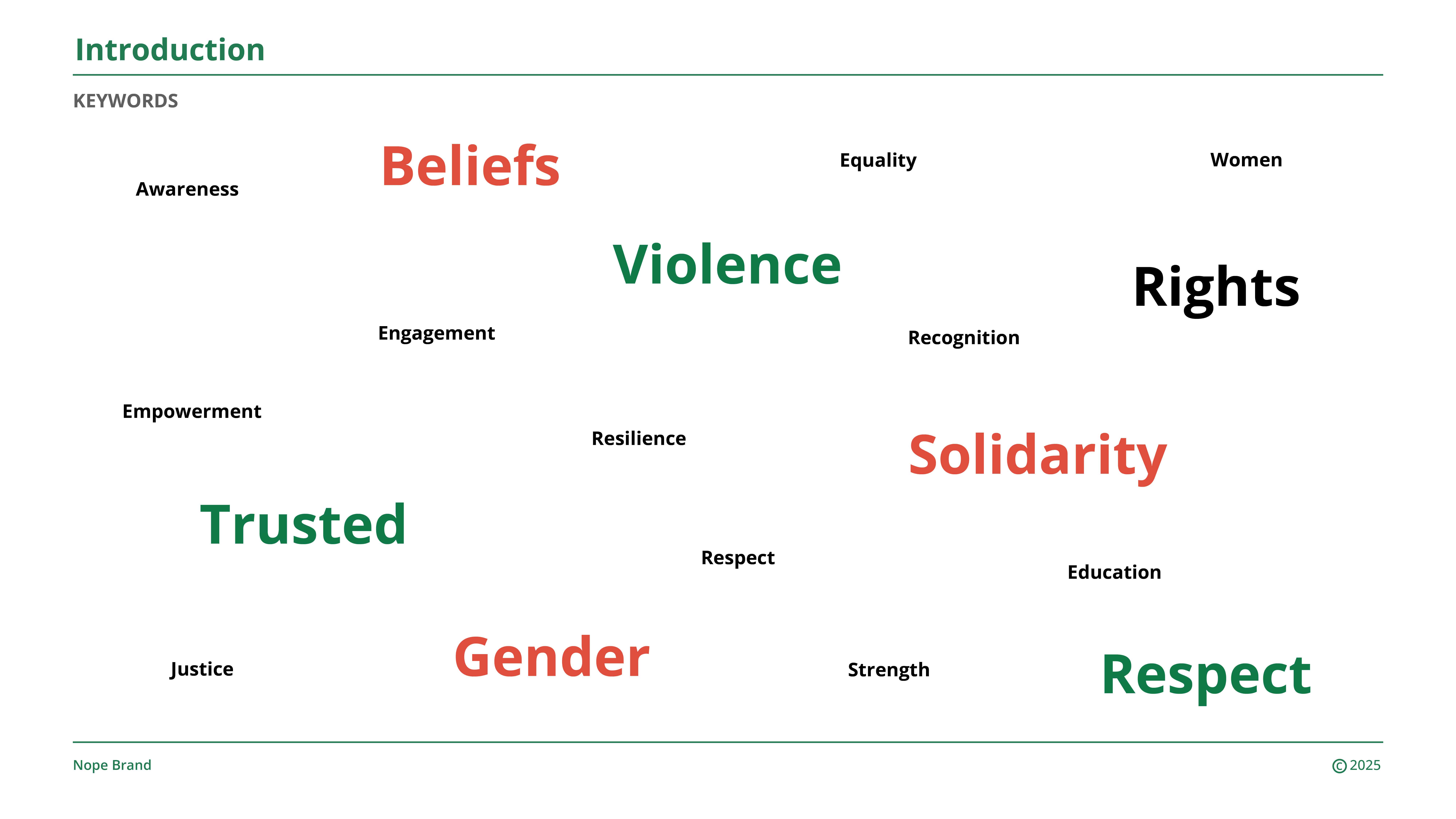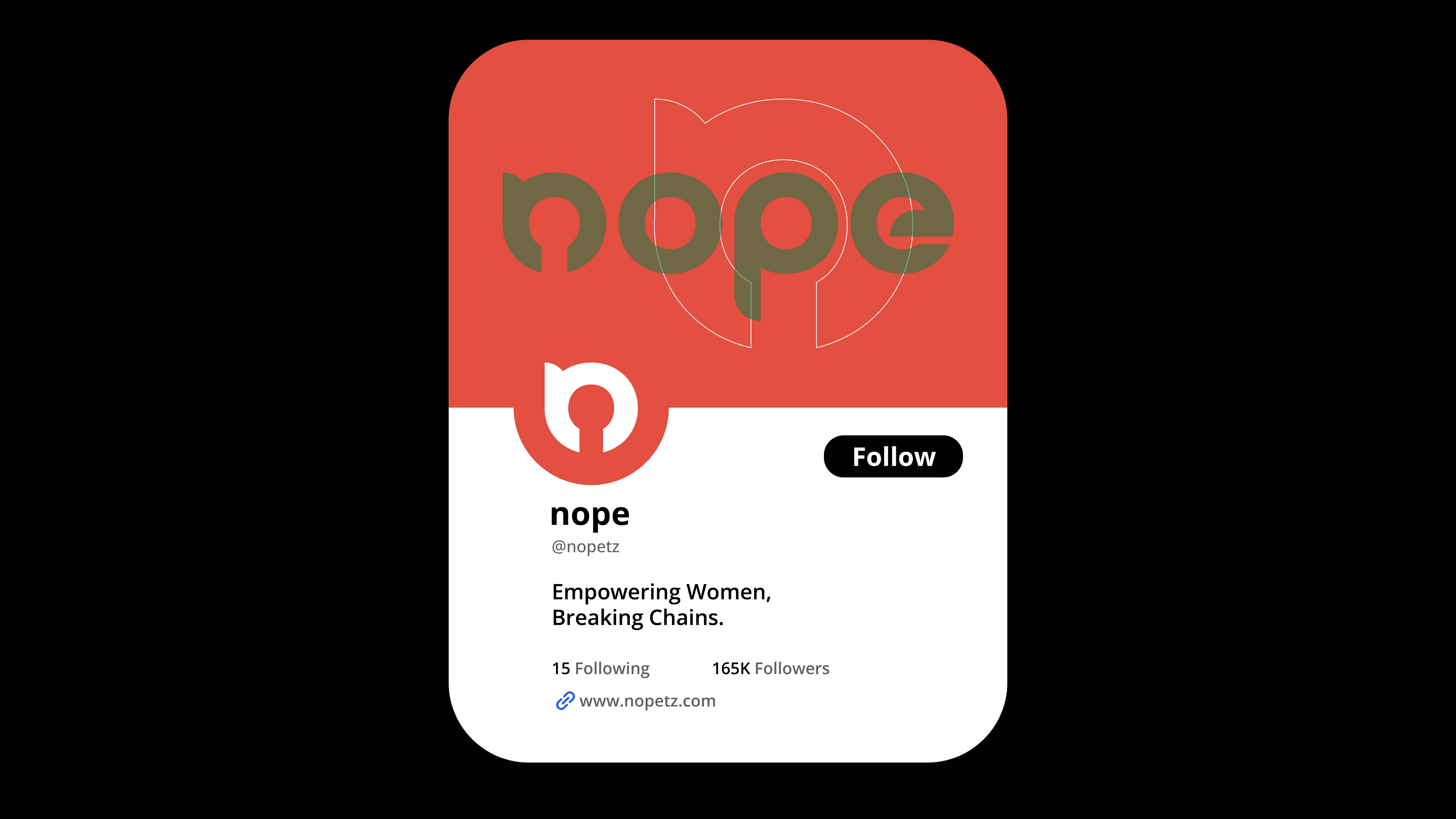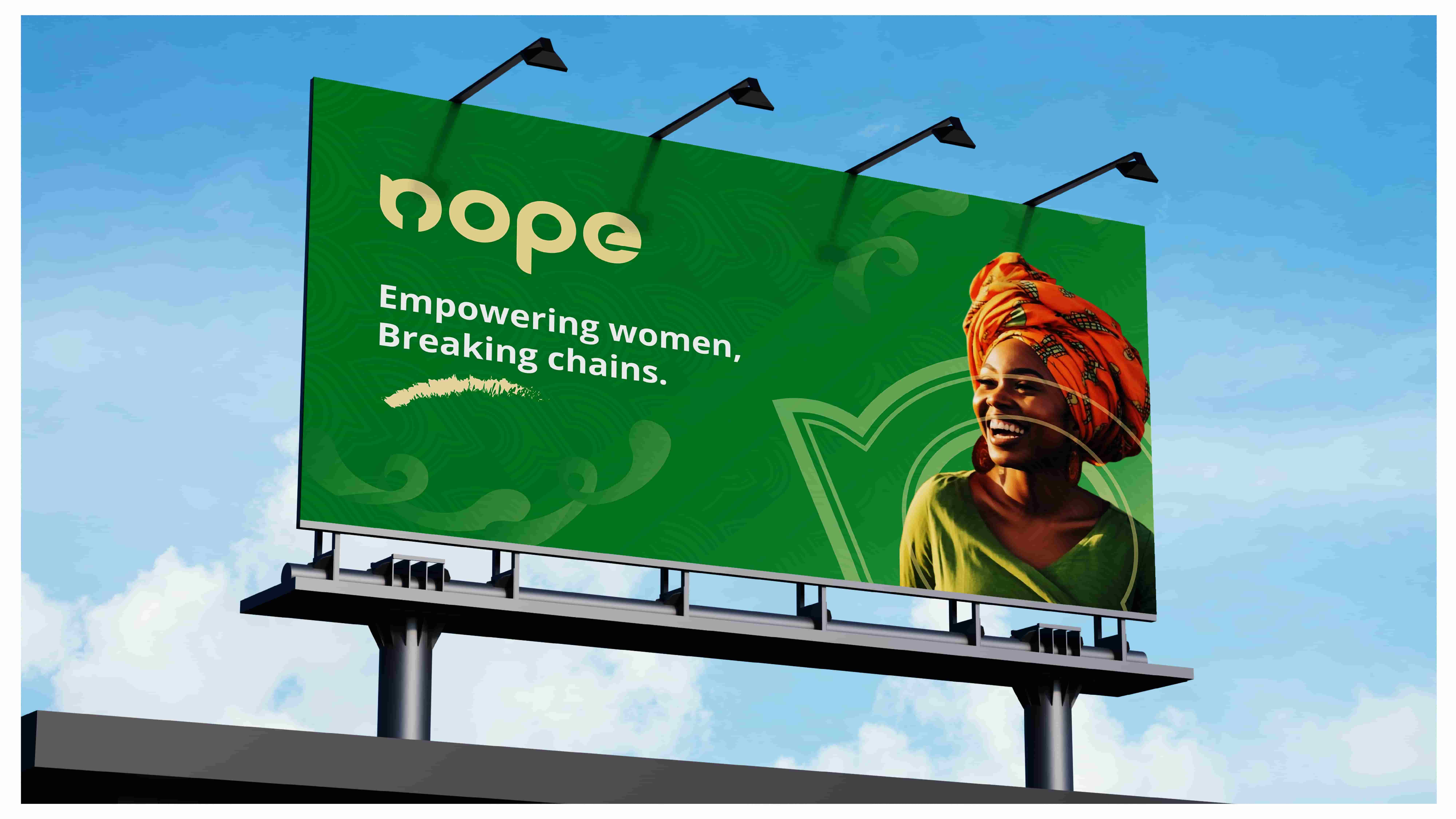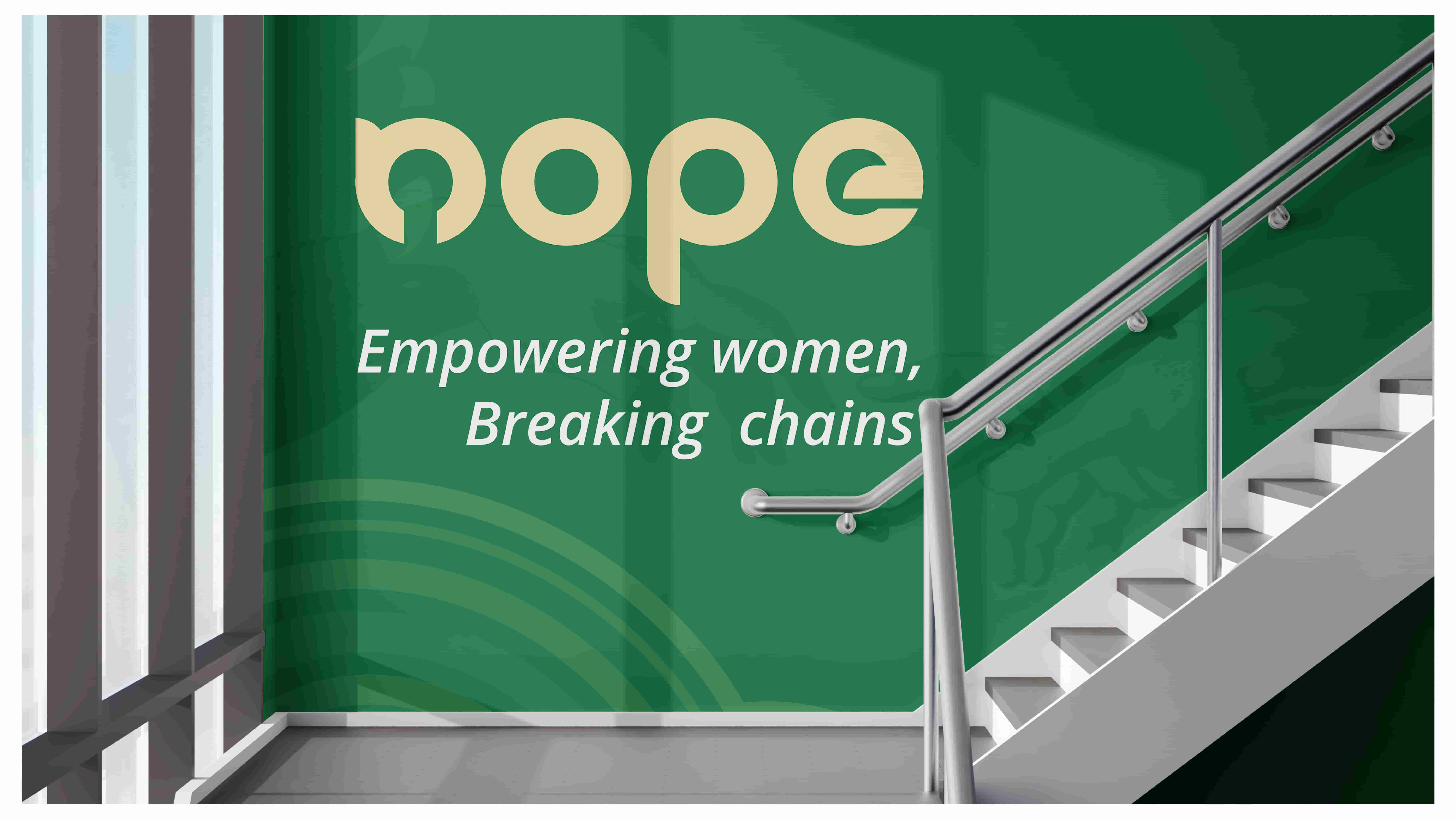
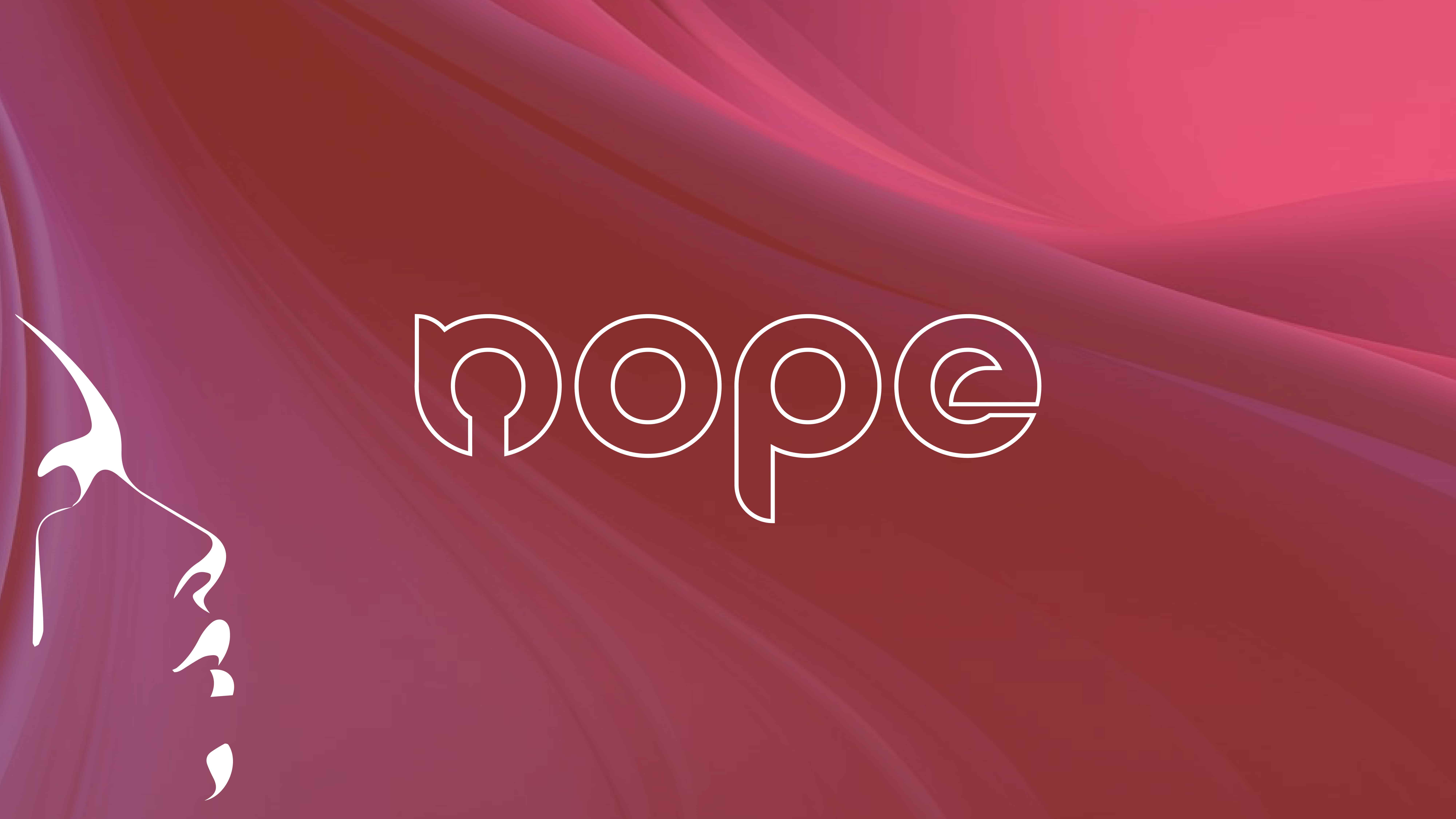
Nope.
A playful, color-first identity system designed to empower a modern NGO. Built to break the mold of traditional corporate activism through flexible, illustrative marks.
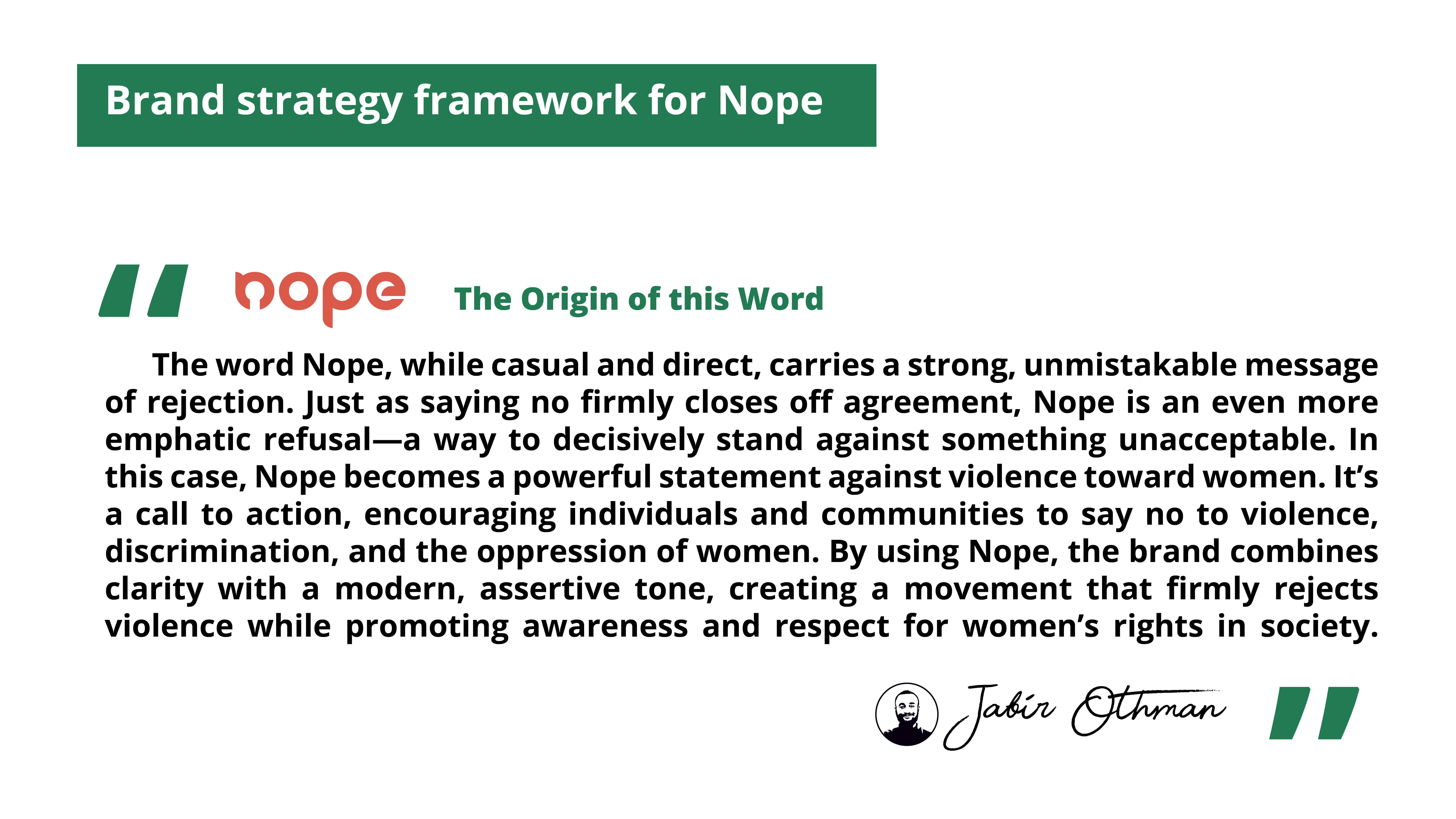
The Challenge
Activism branding often falls into two traps: it’s either overly corporate and unapproachable, or it’s aggressively militant, alienating broader audiences. The "Nope" initiative needed an identity that felt fundamentally different.
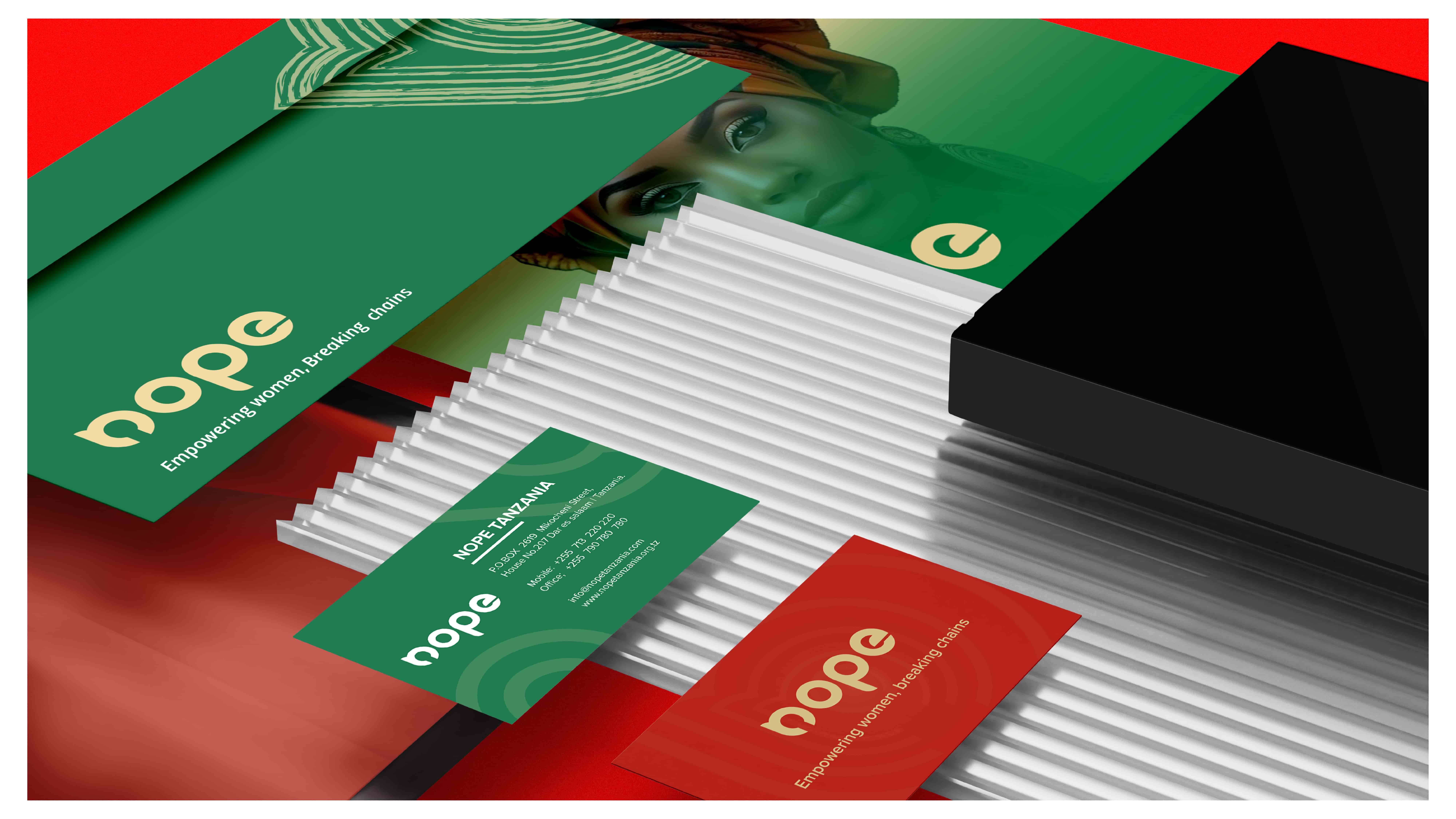
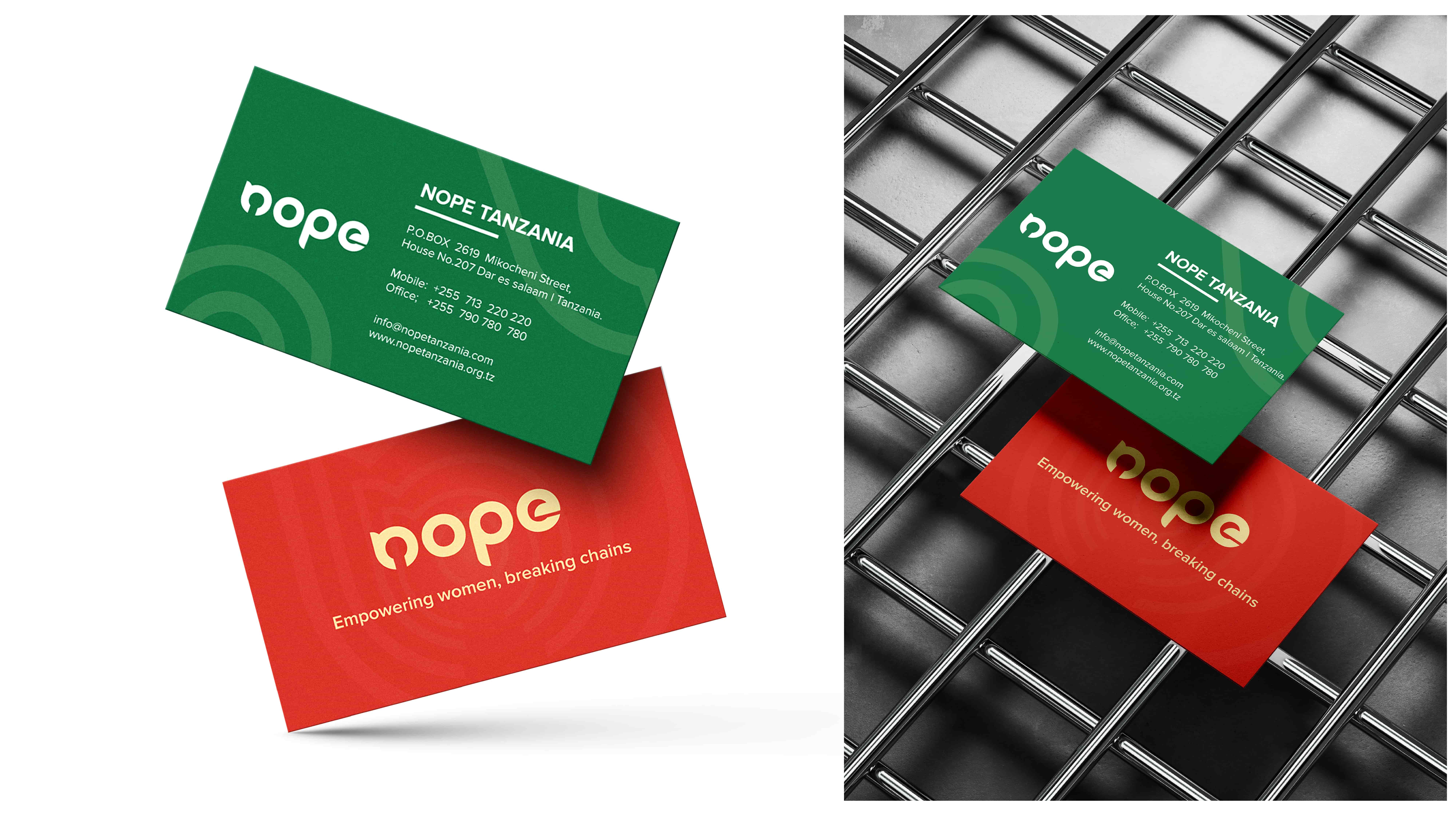
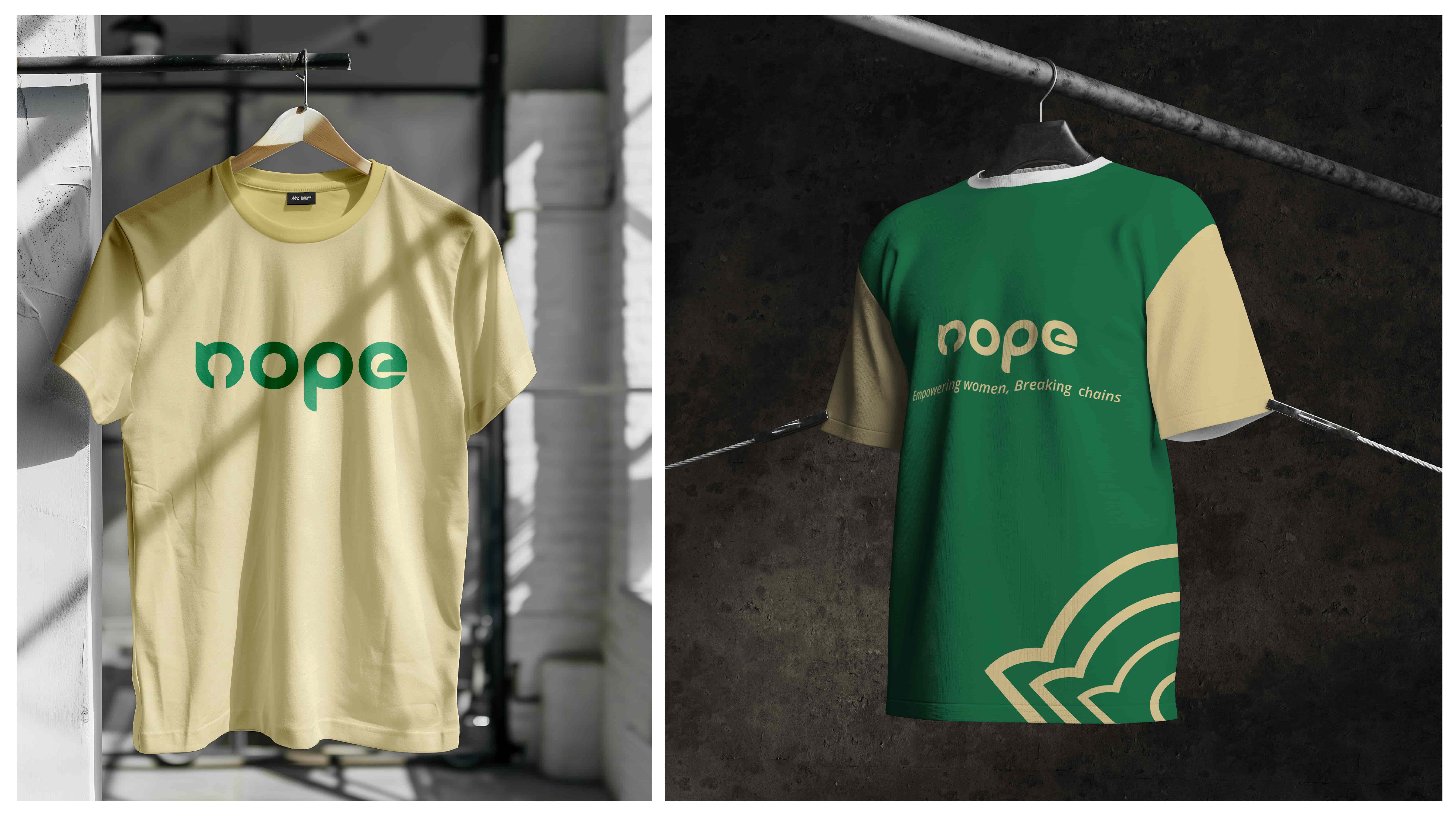
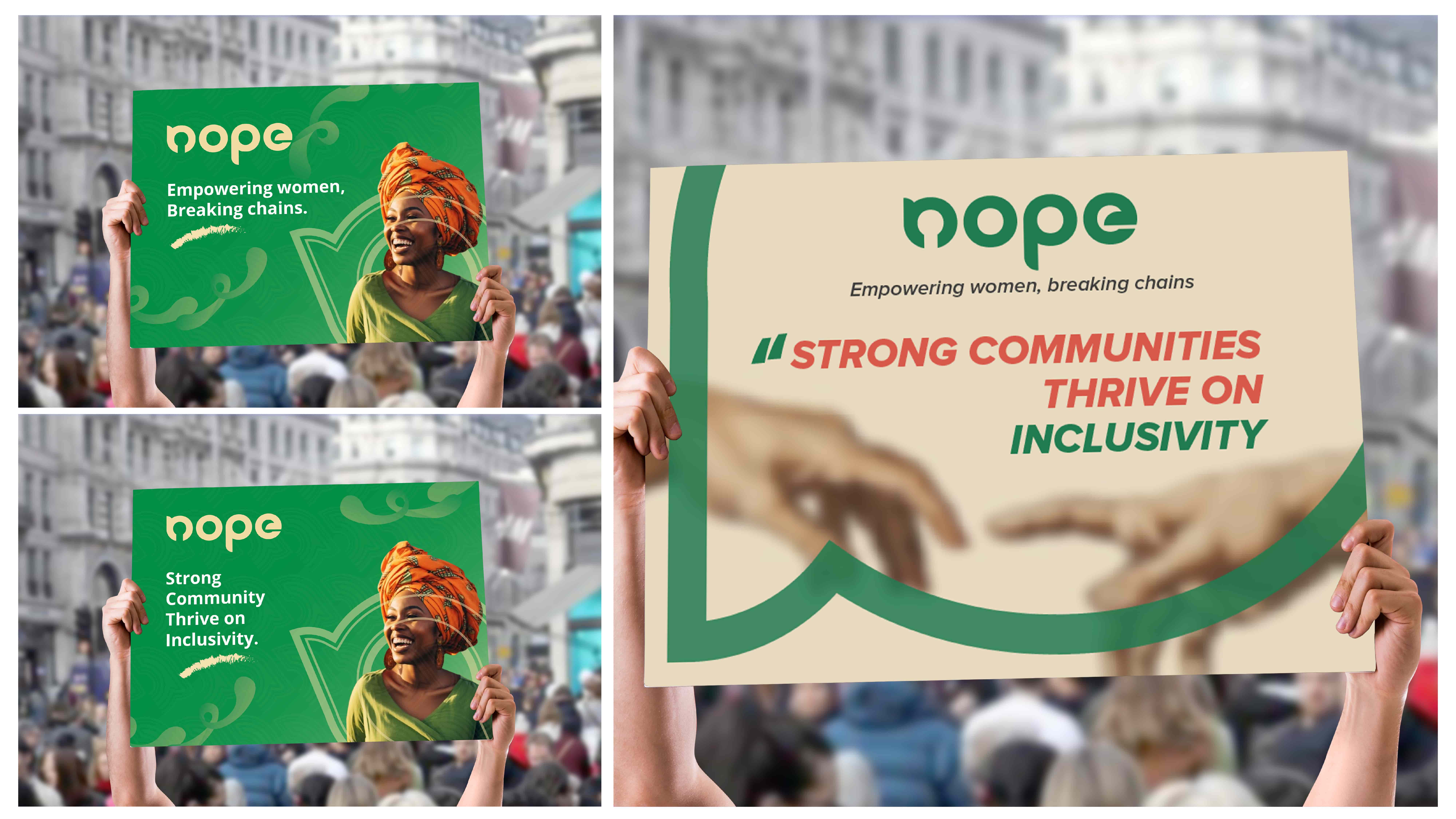
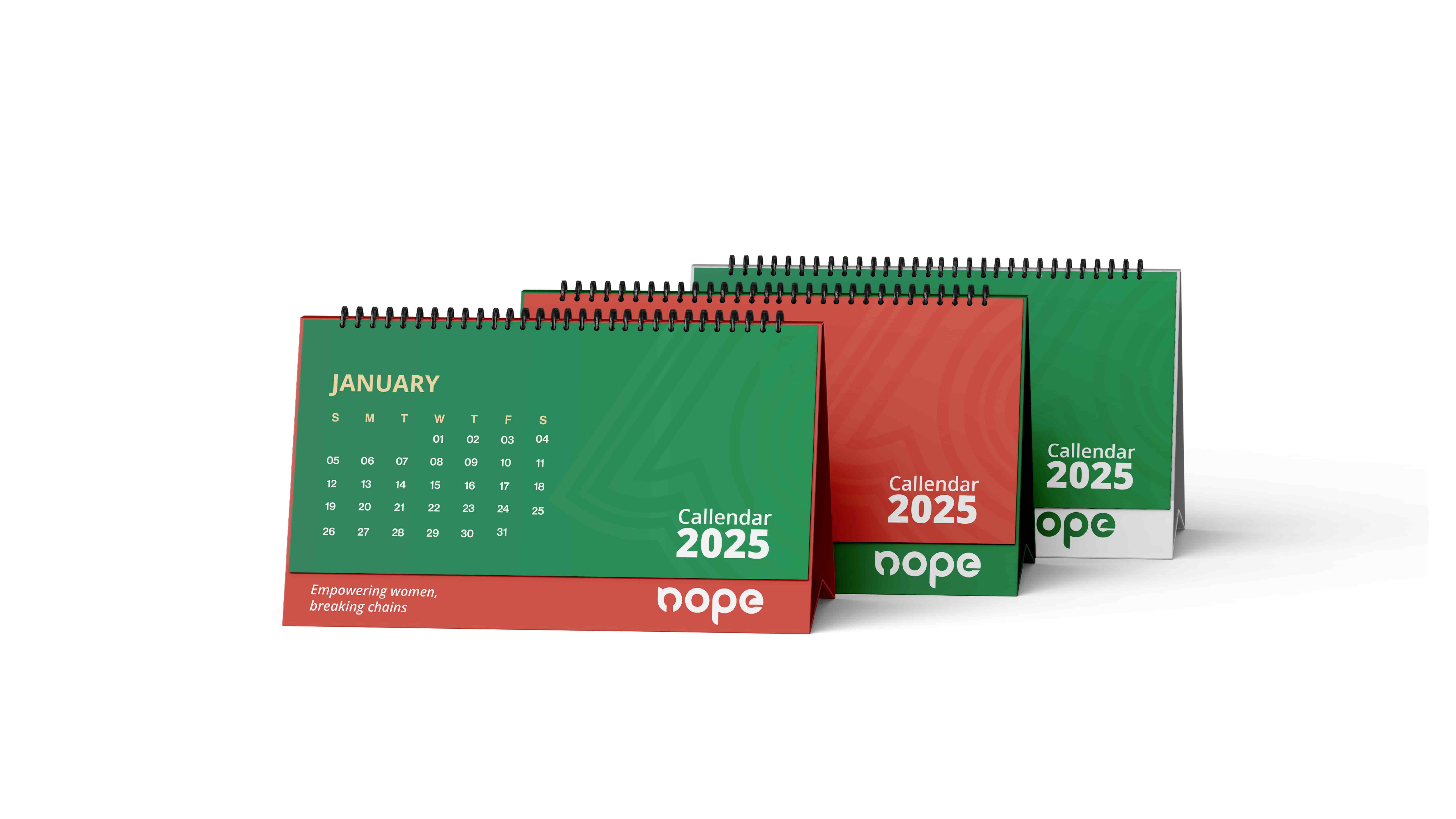
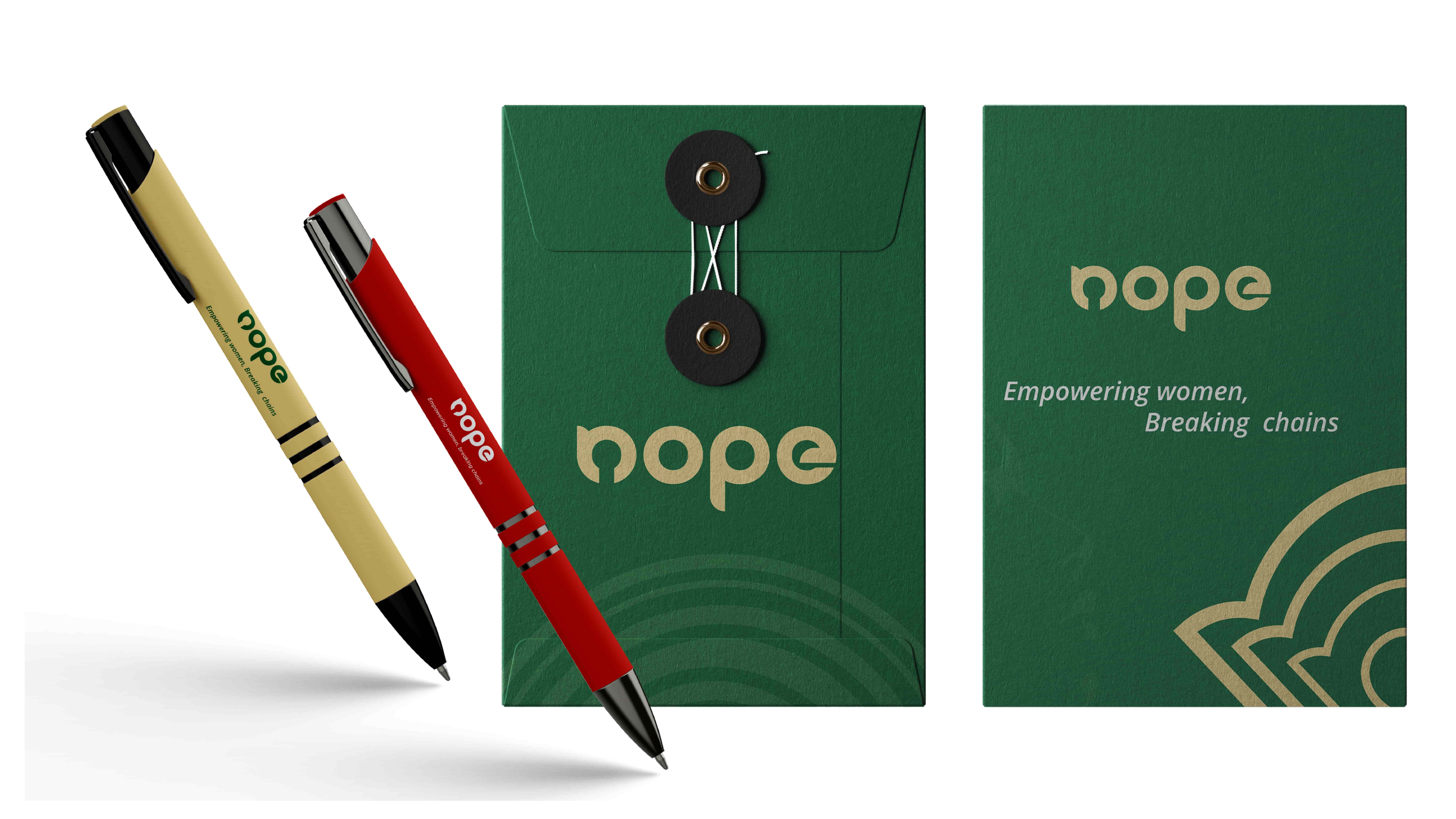
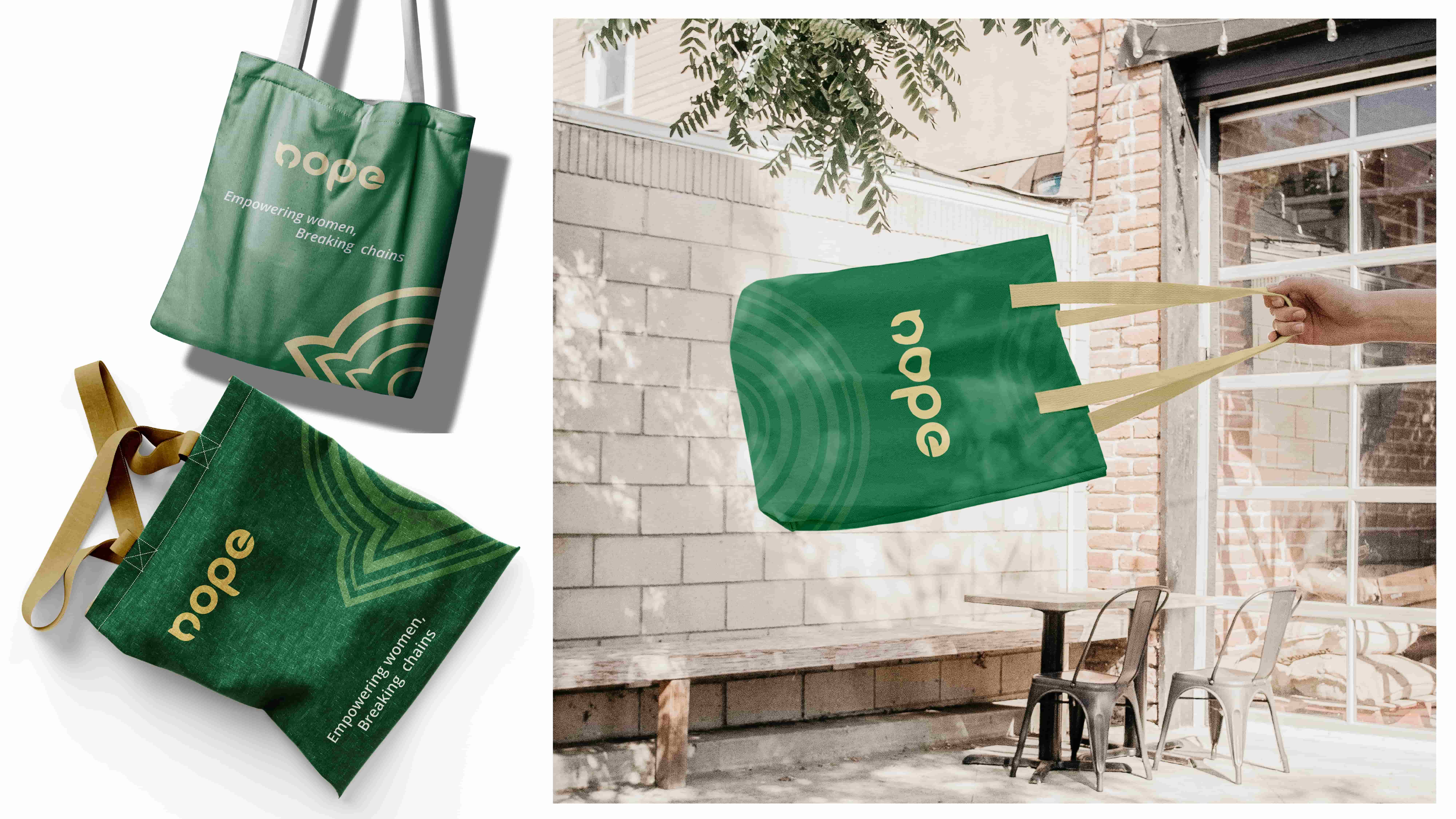
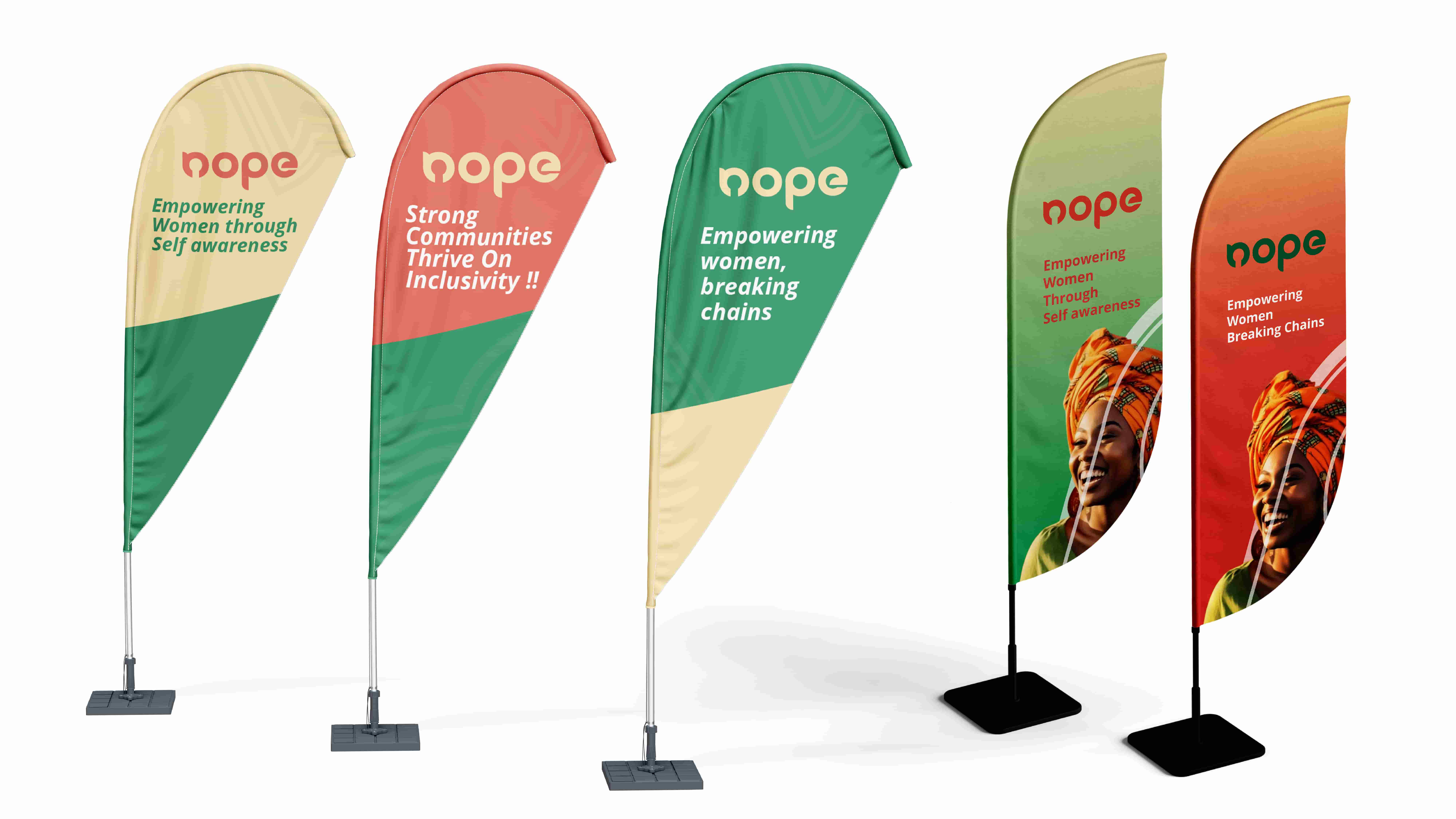
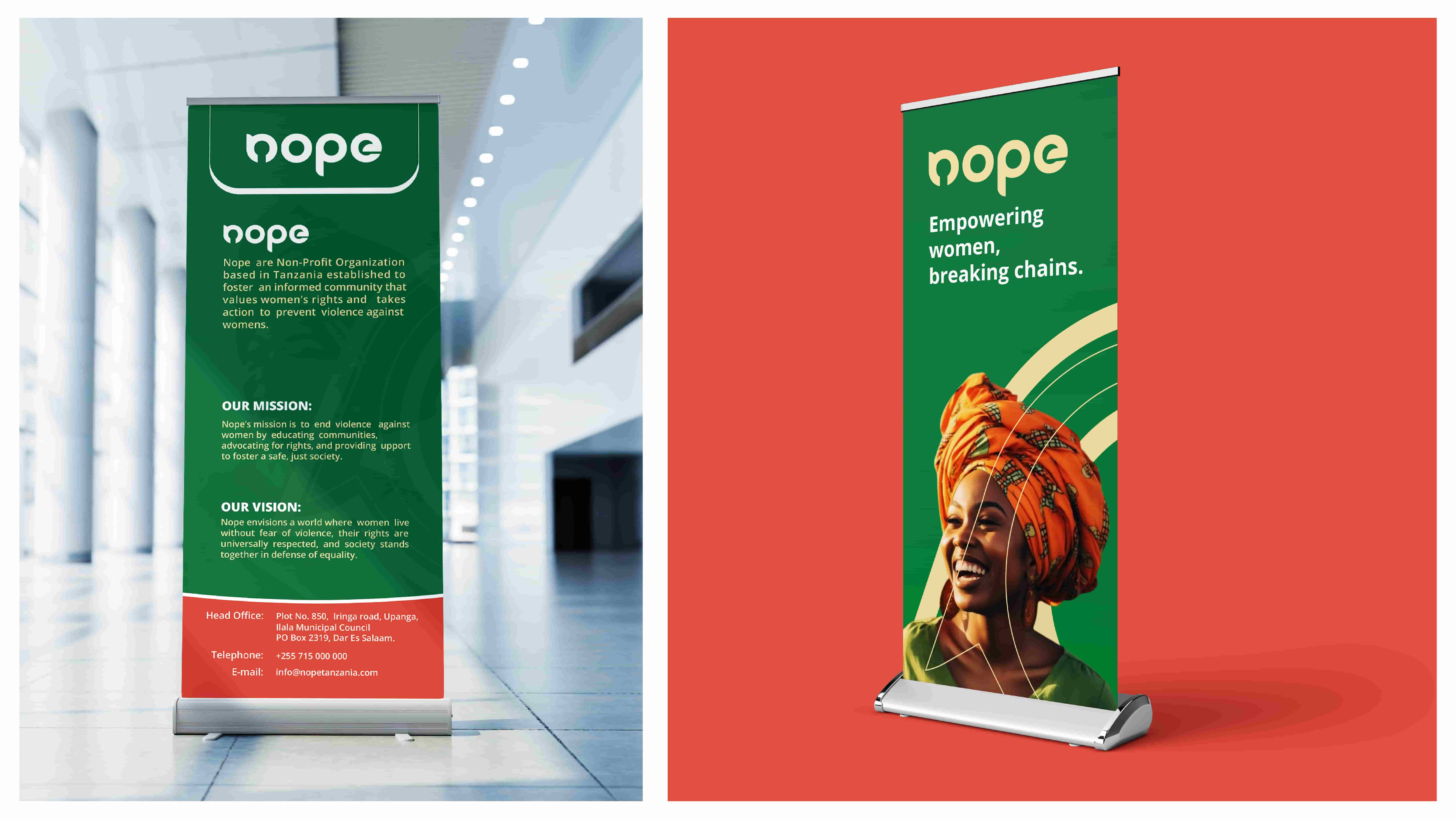
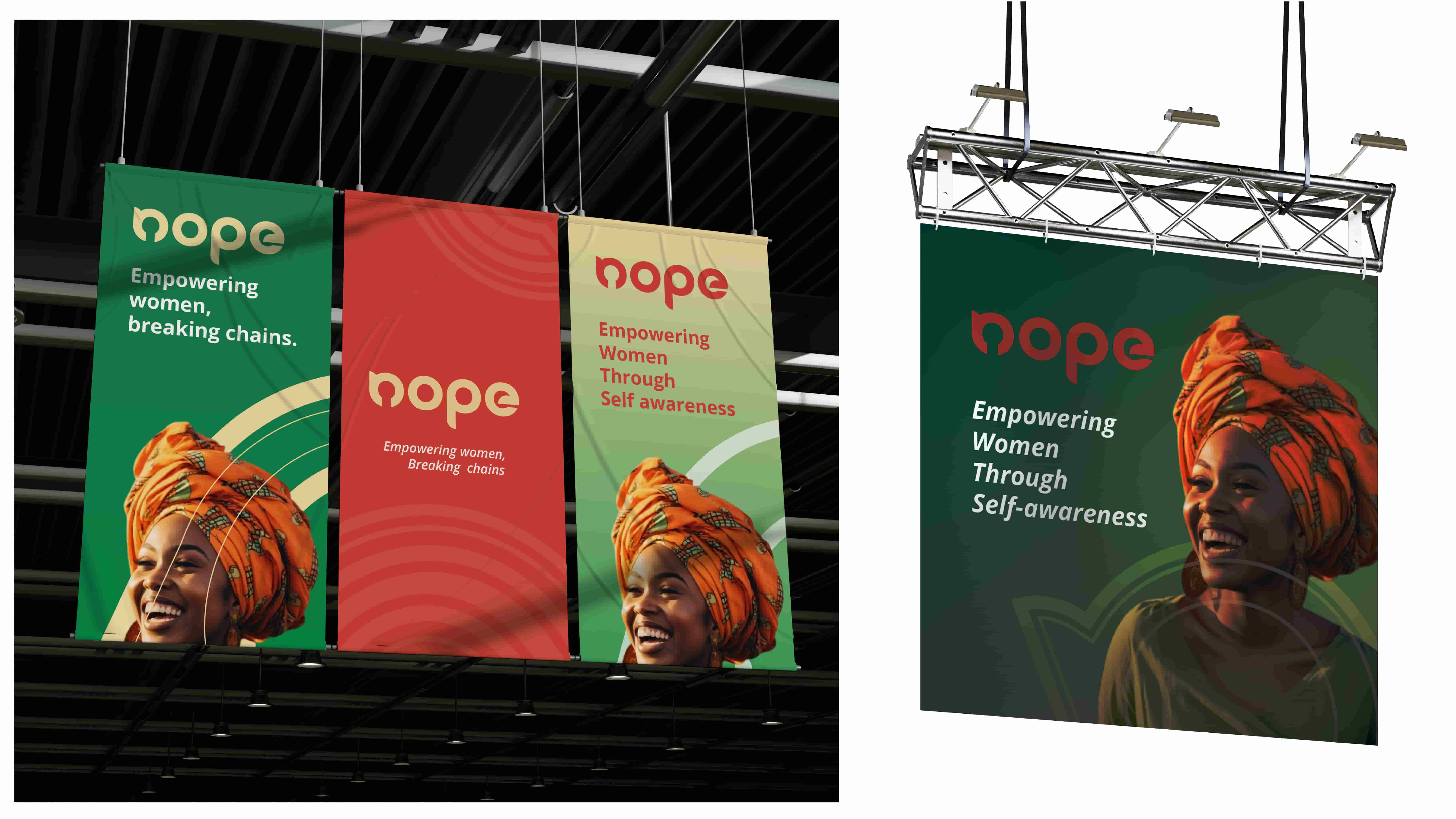
They required a visual system that was highly accessible, energetic, and capable of adapting across a wide range of mediums—from digital campaign posts to printed merchandise and flexible packaging for grassroots toolkits.
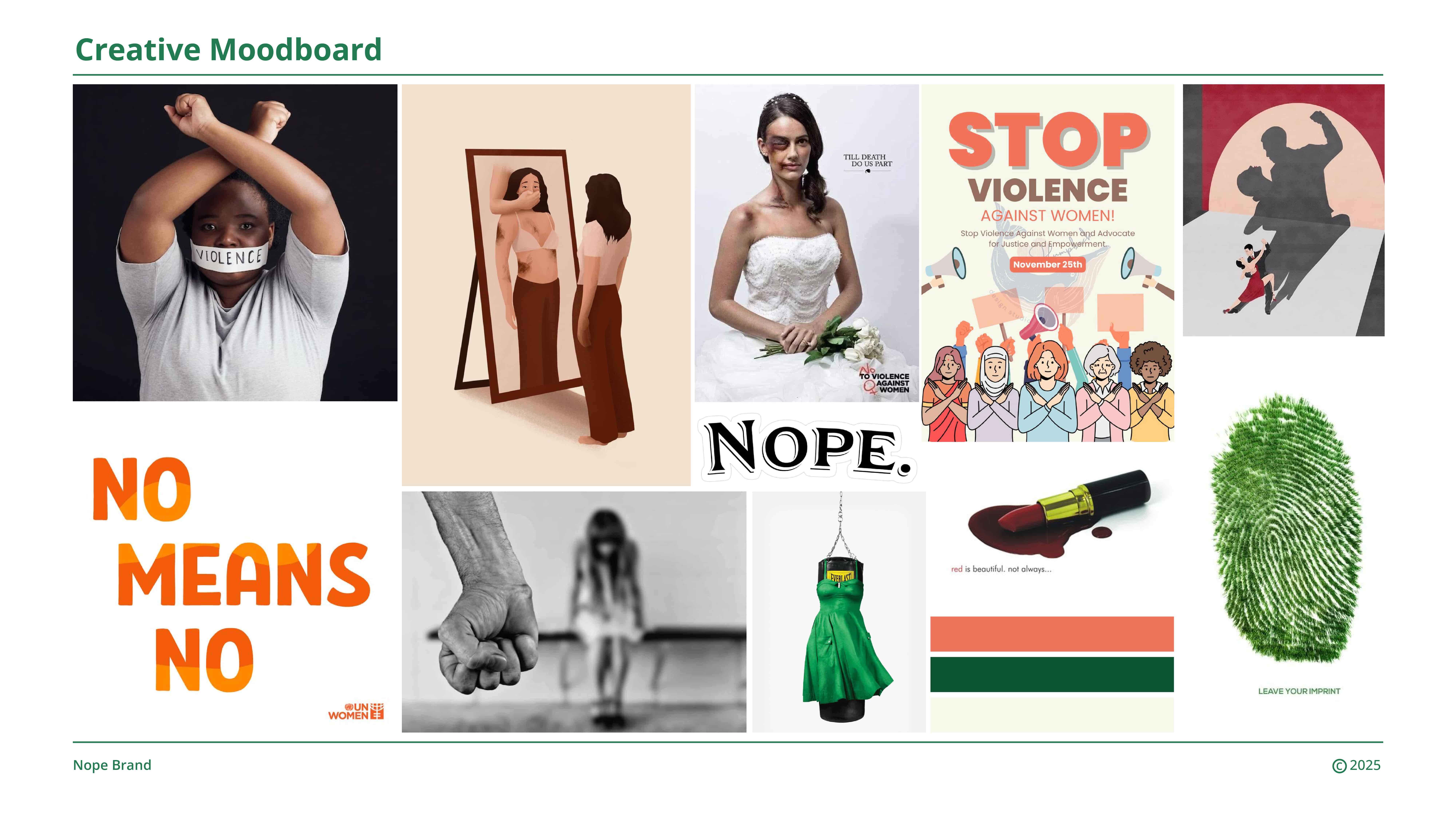
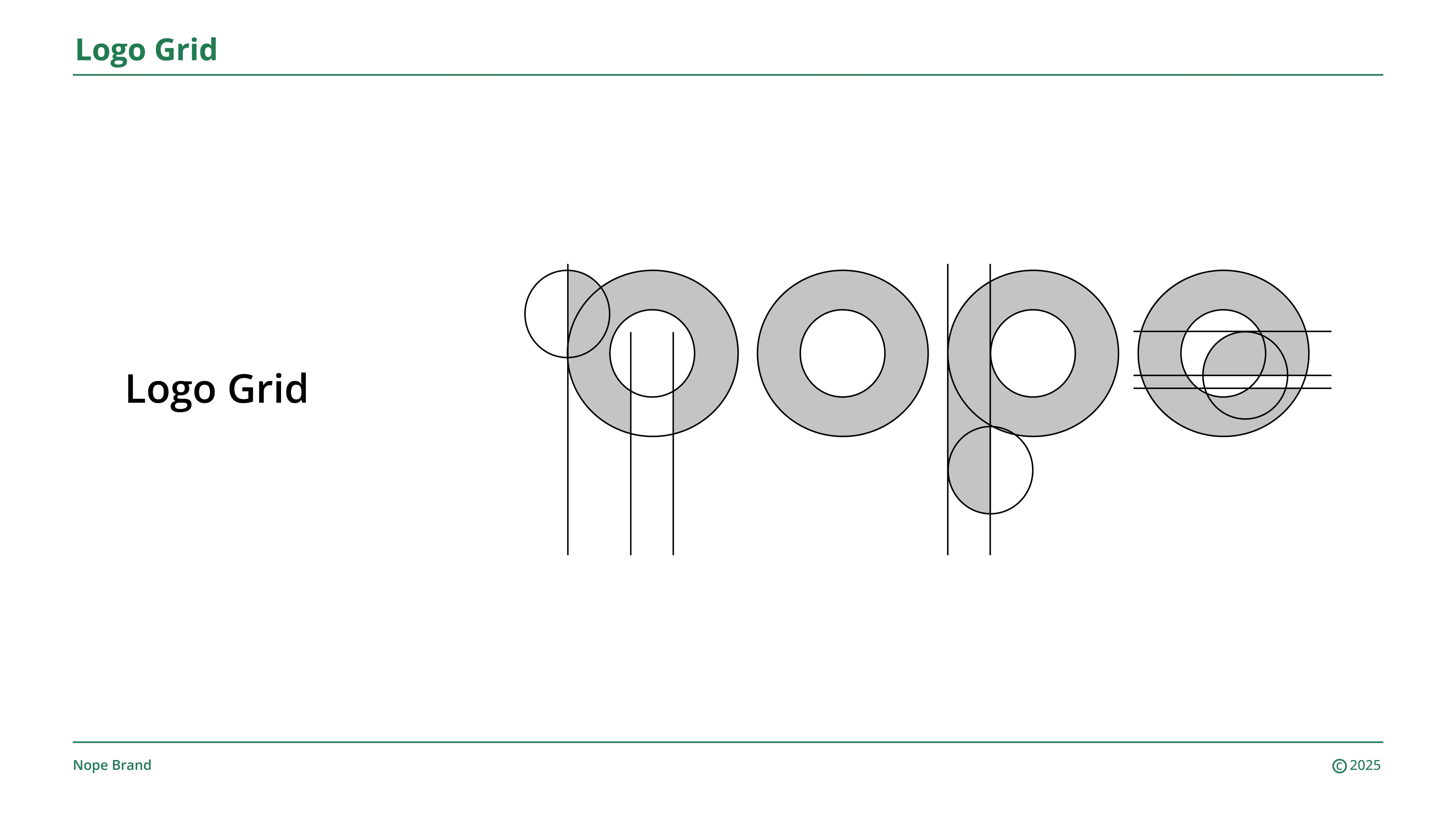
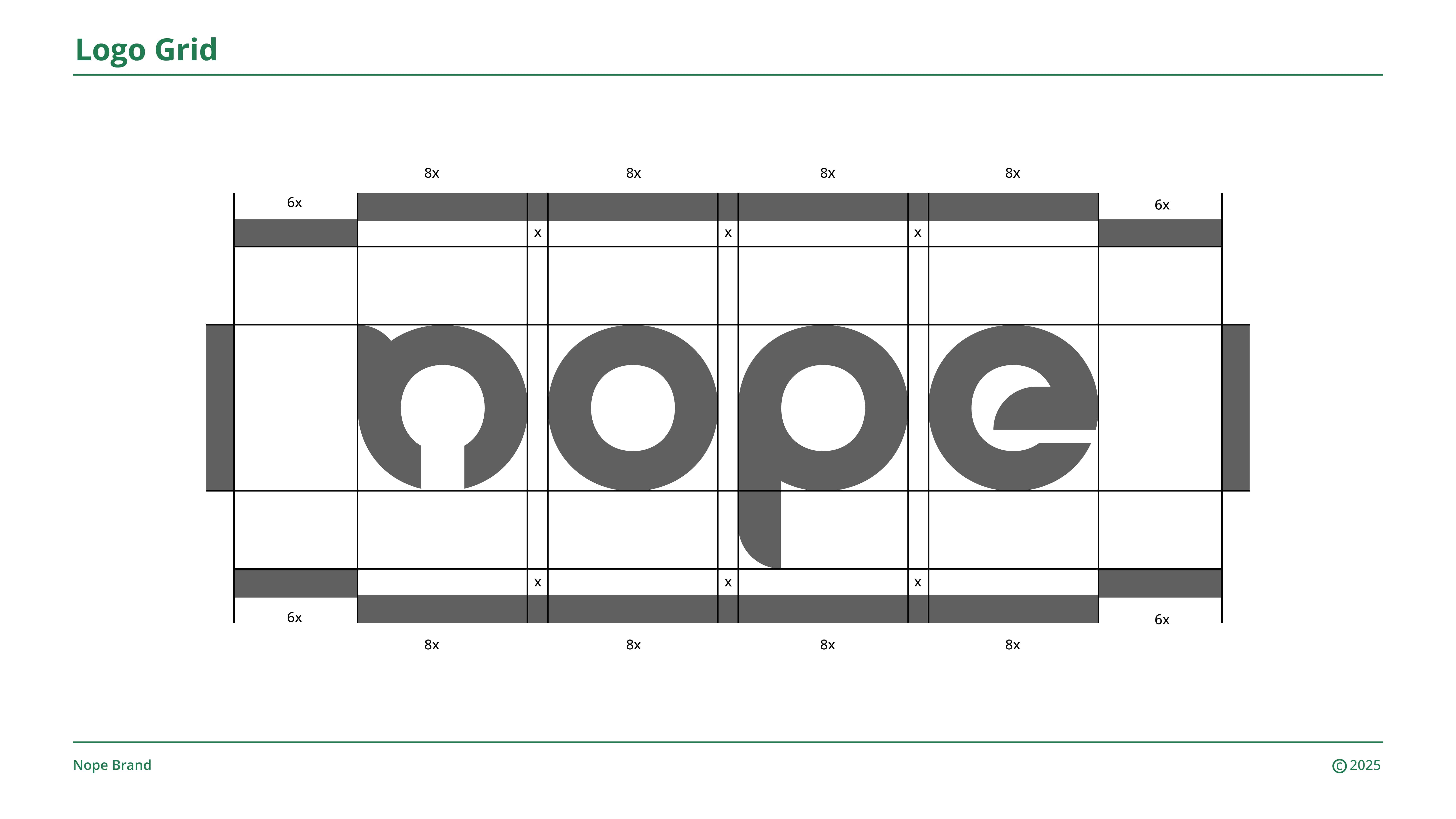
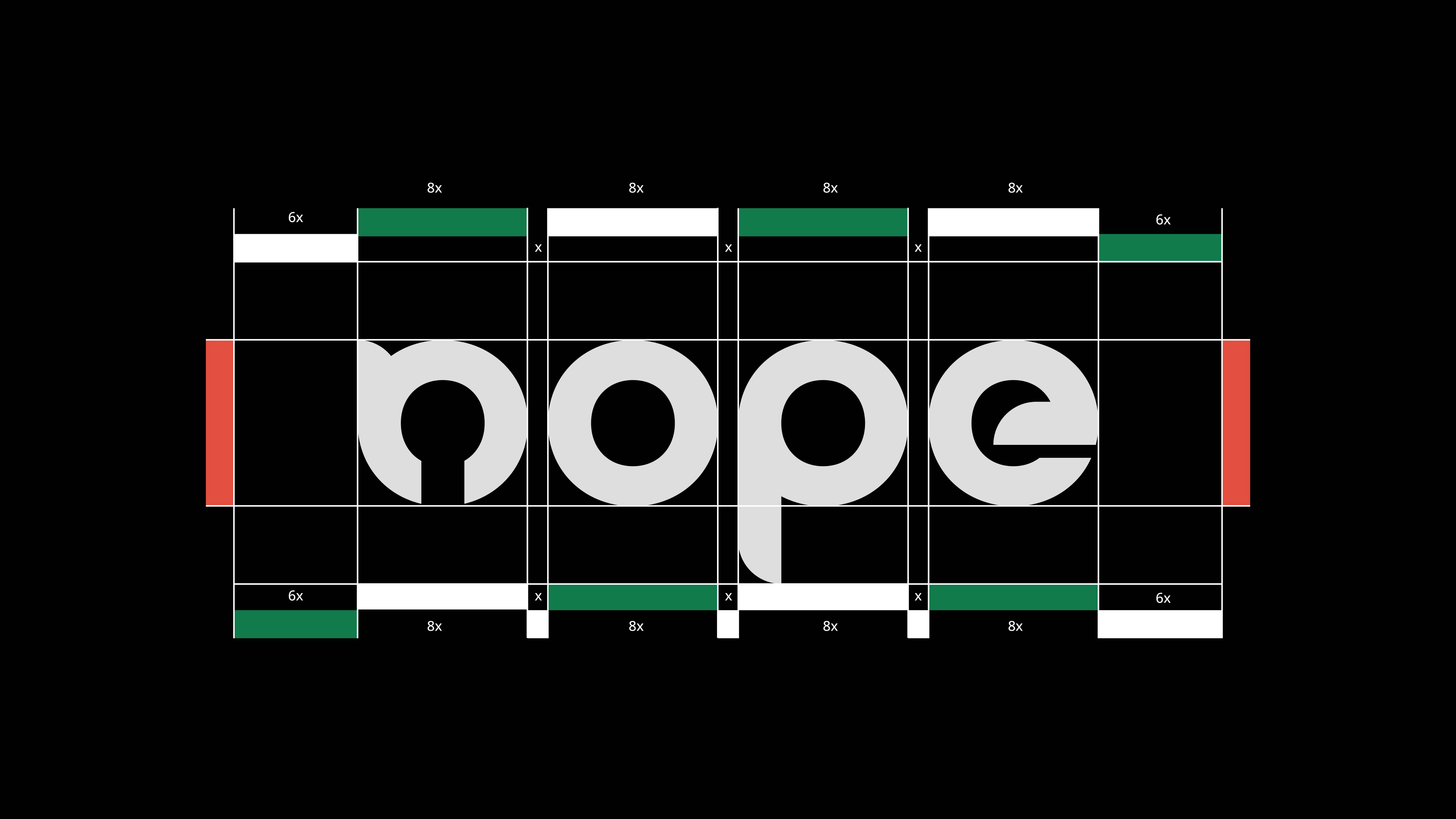
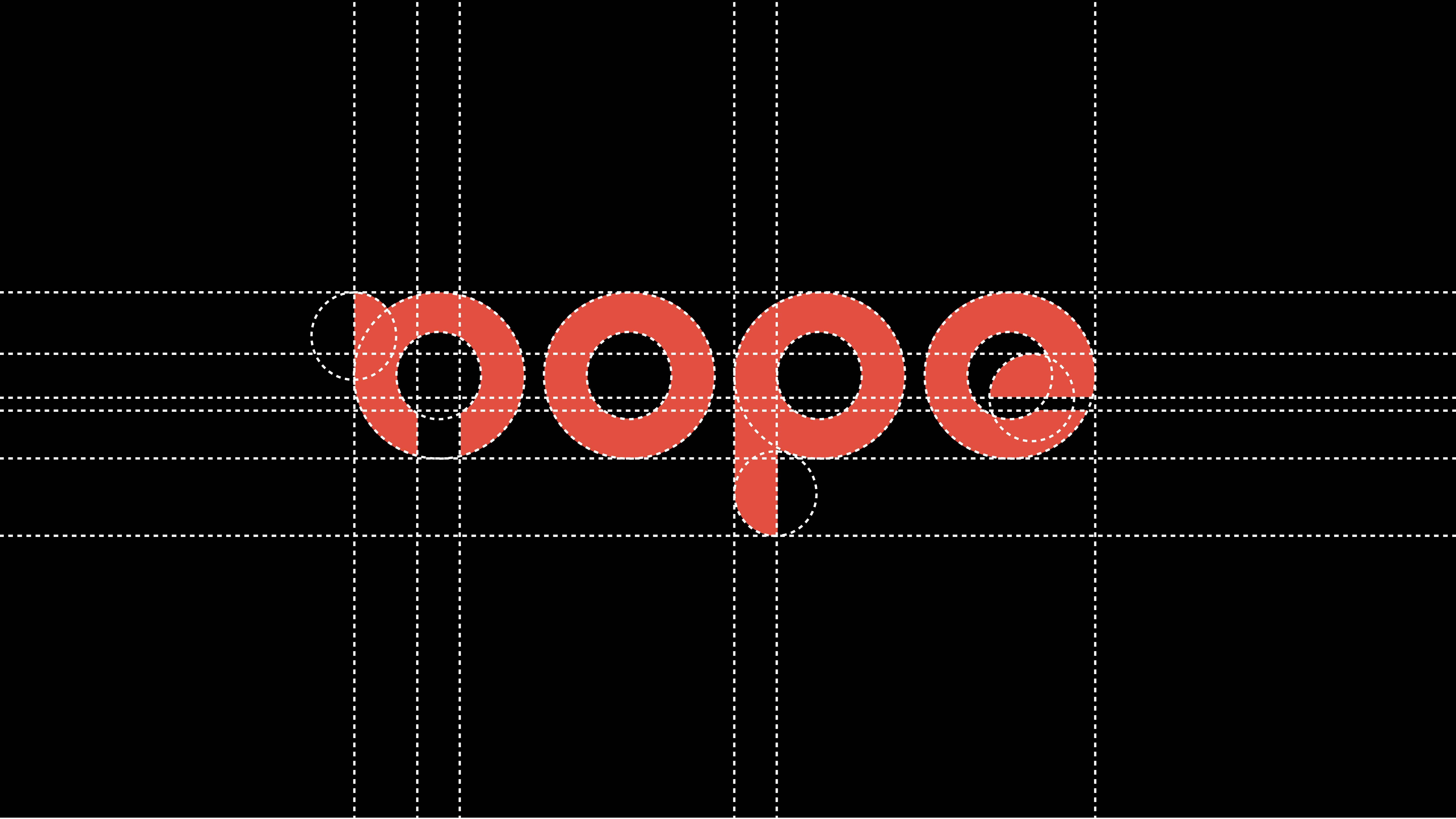
The Solution
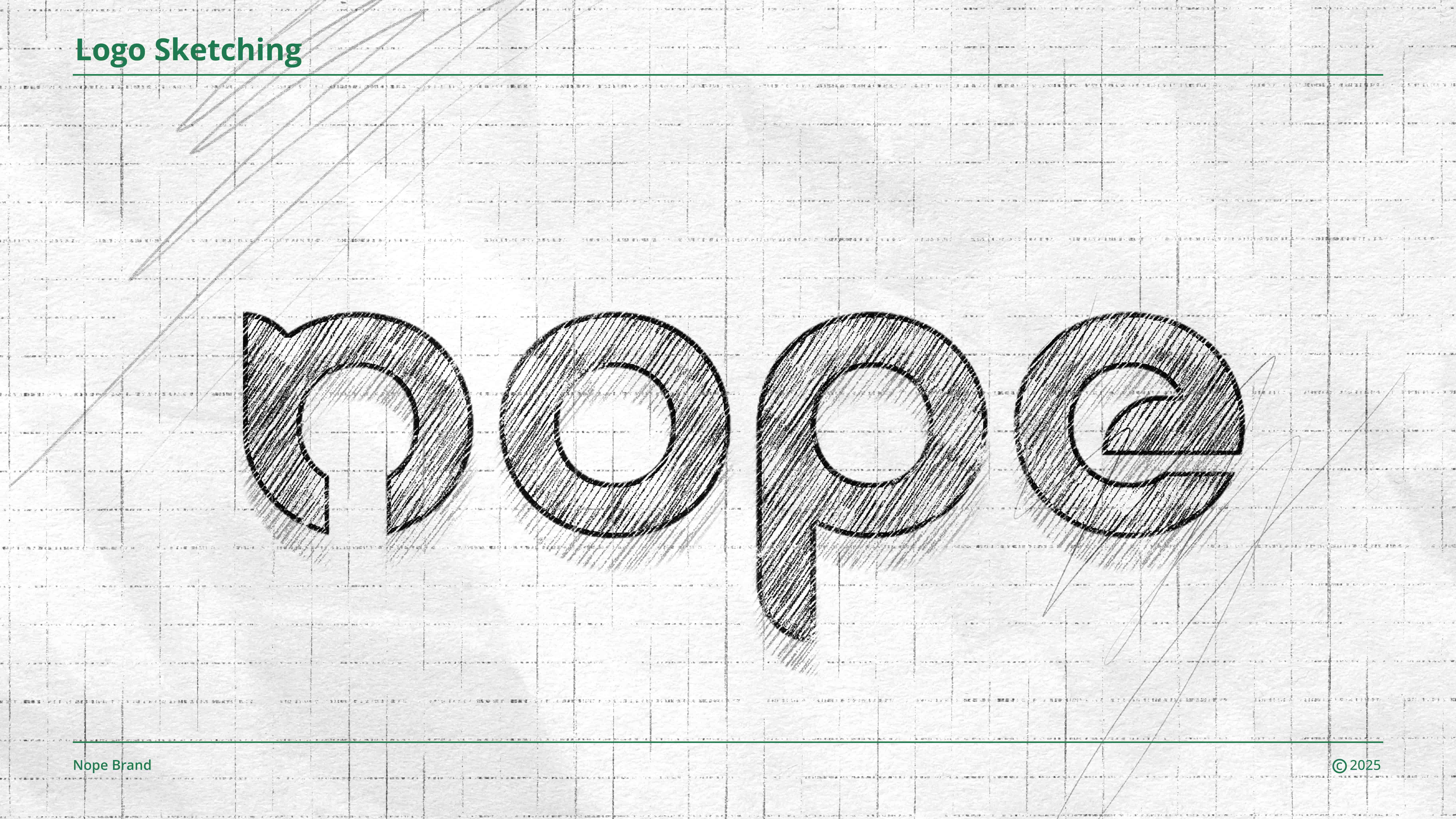
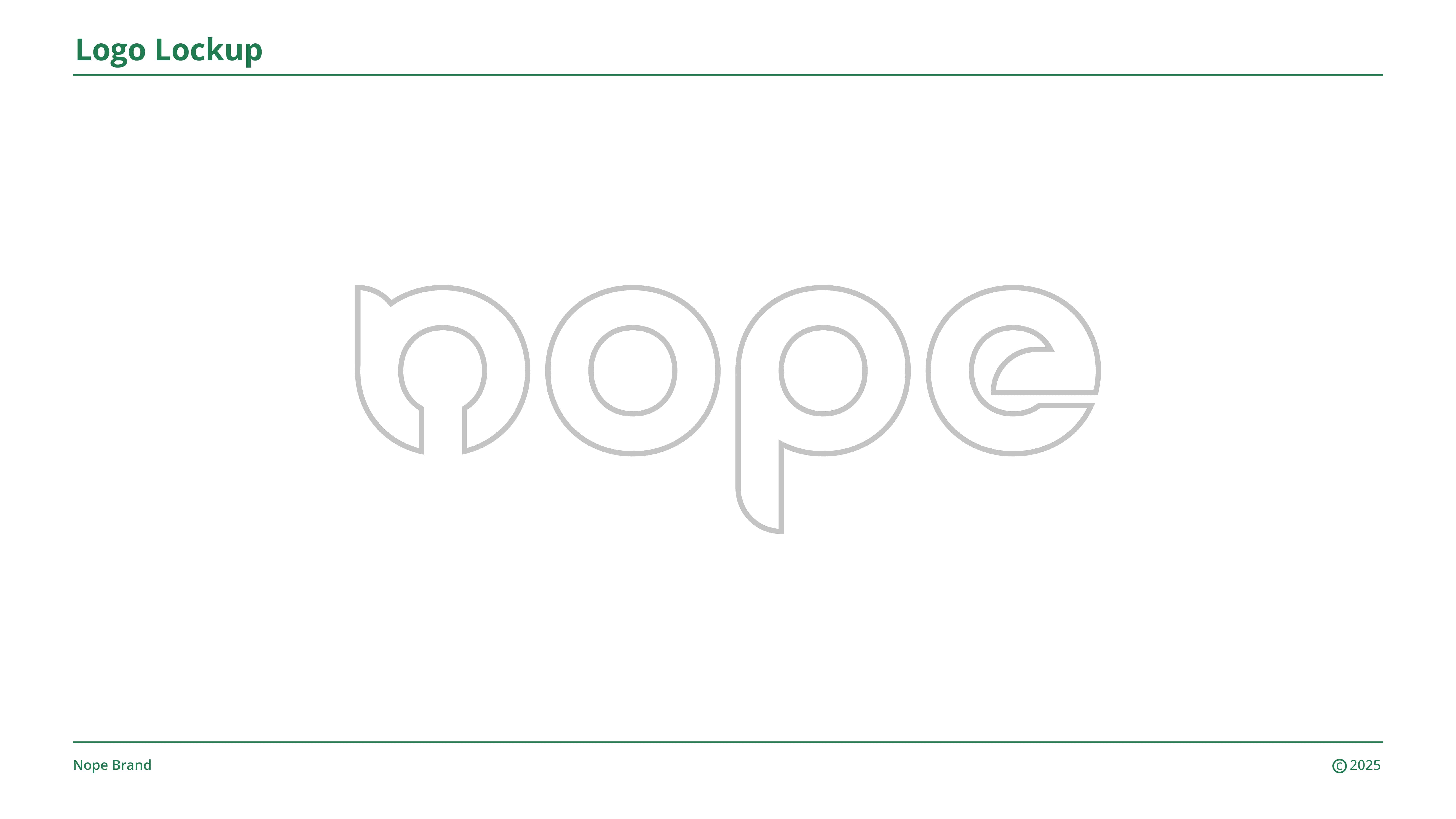
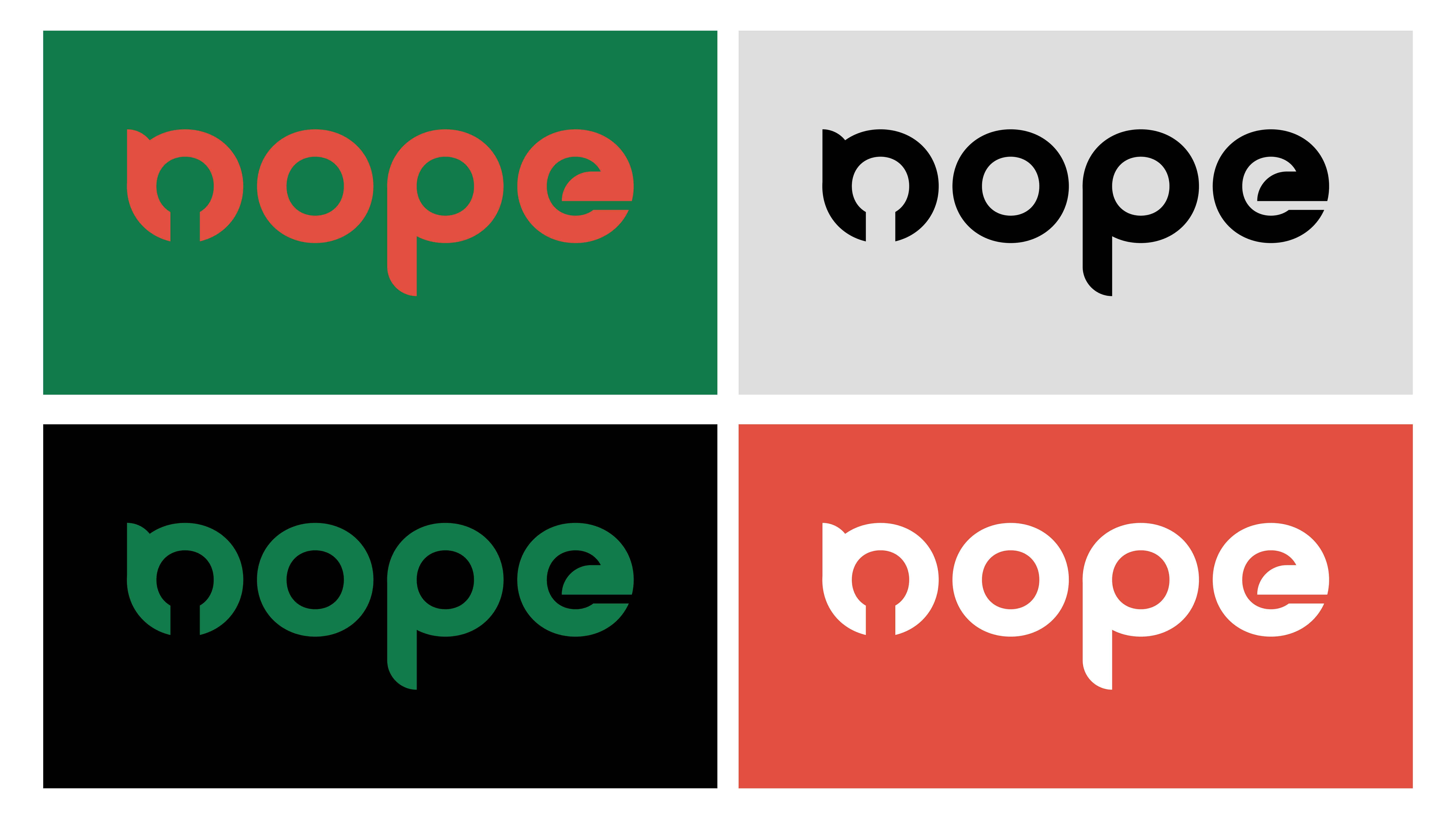
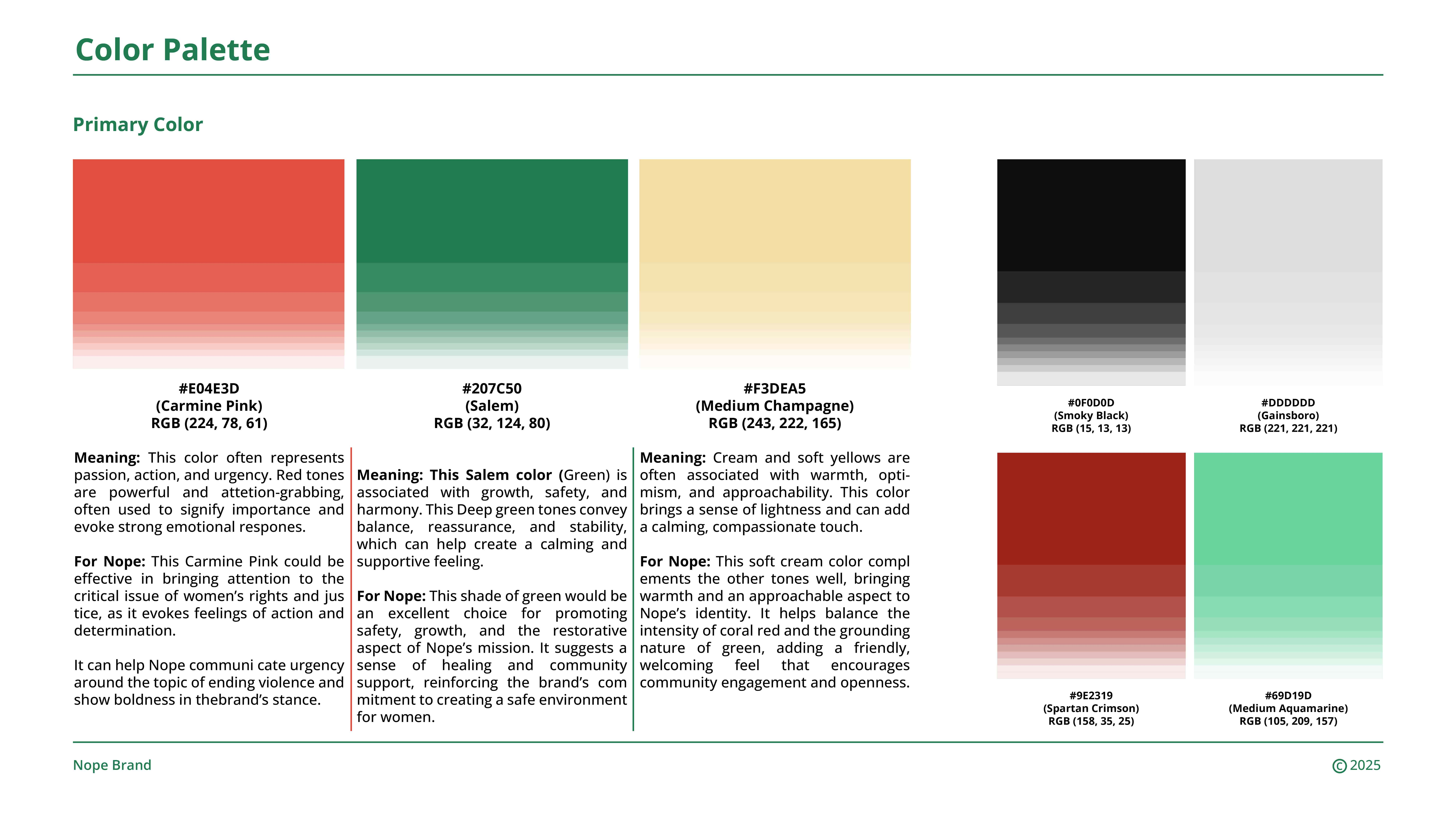
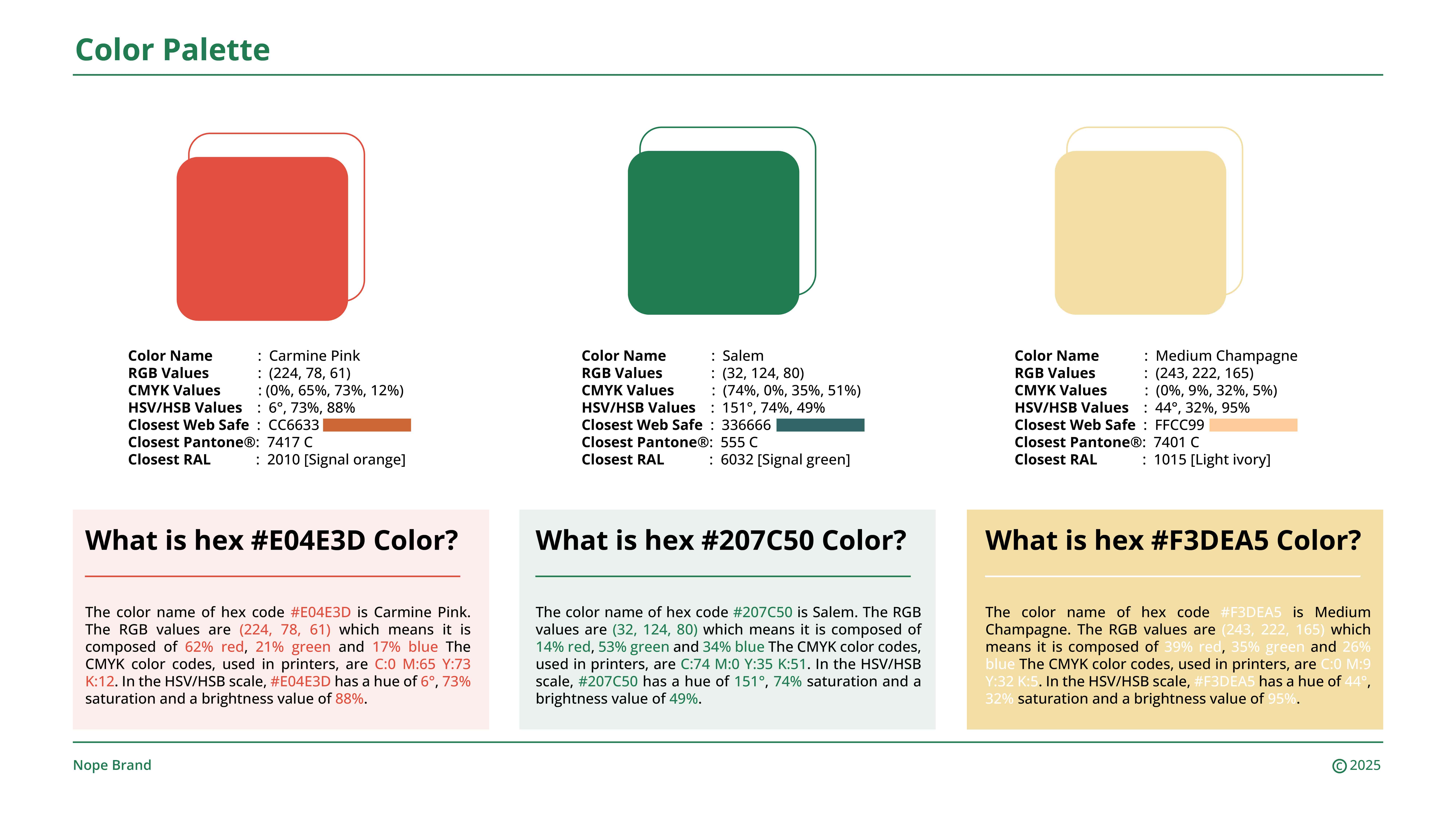
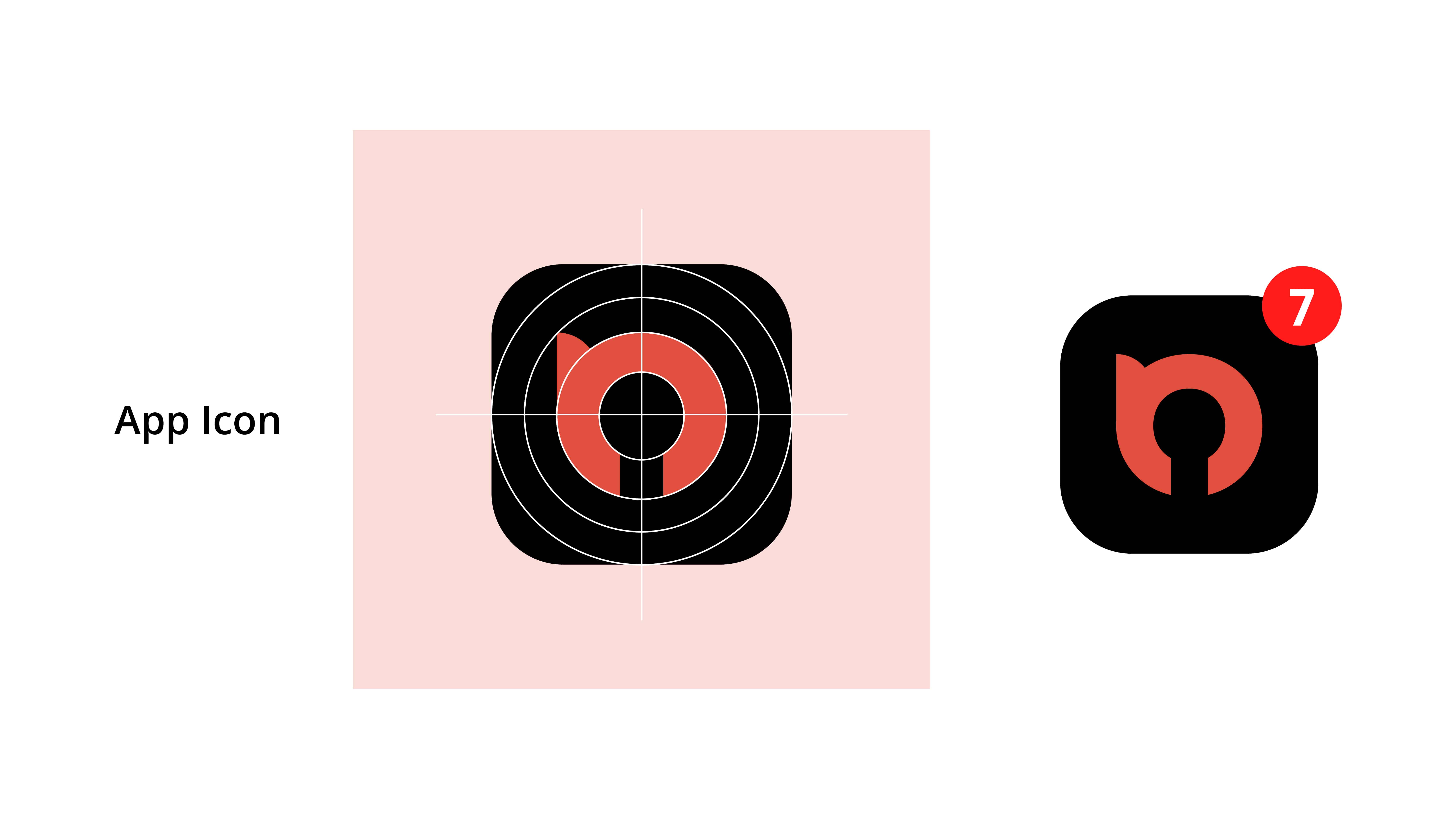
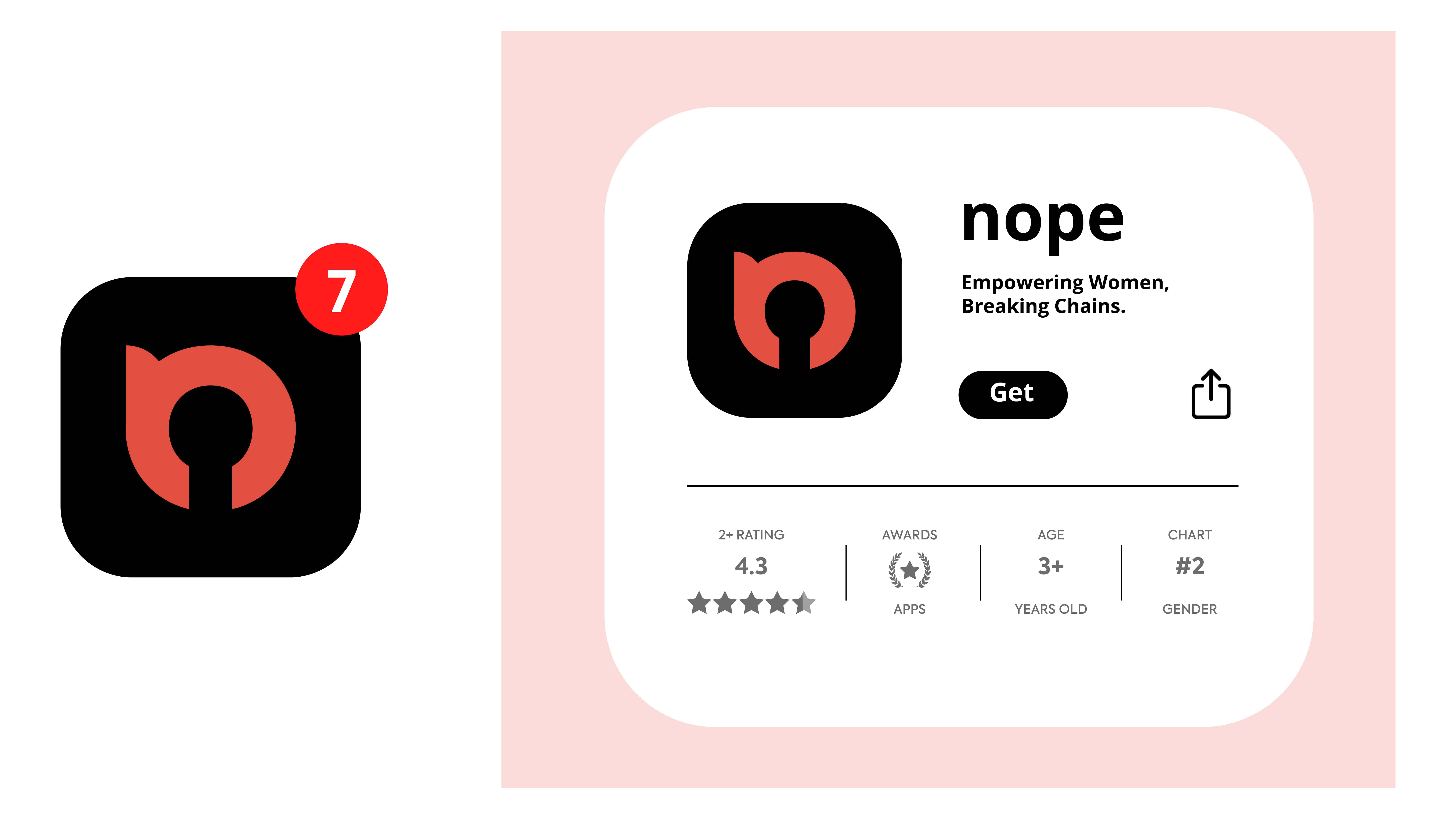
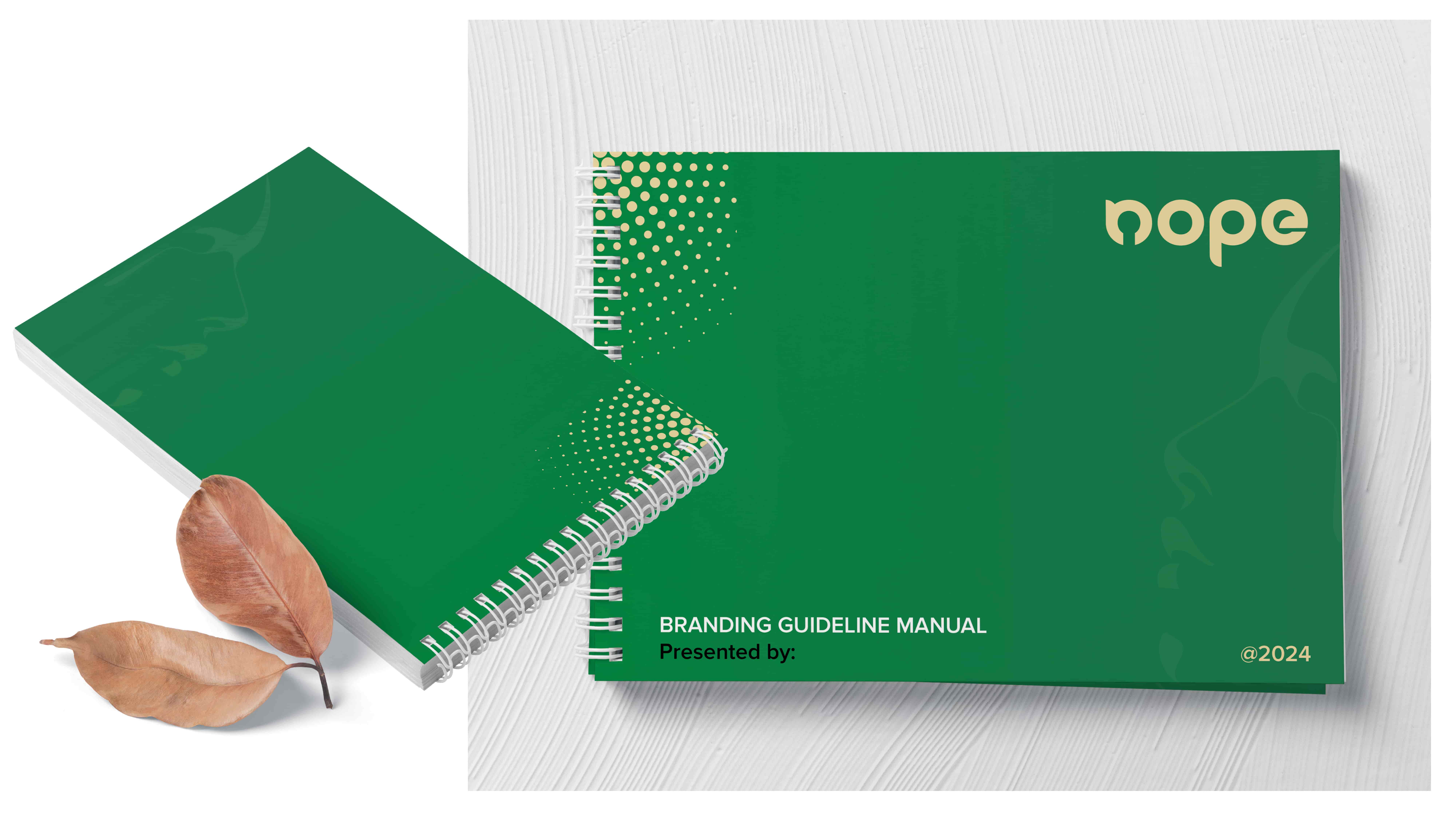
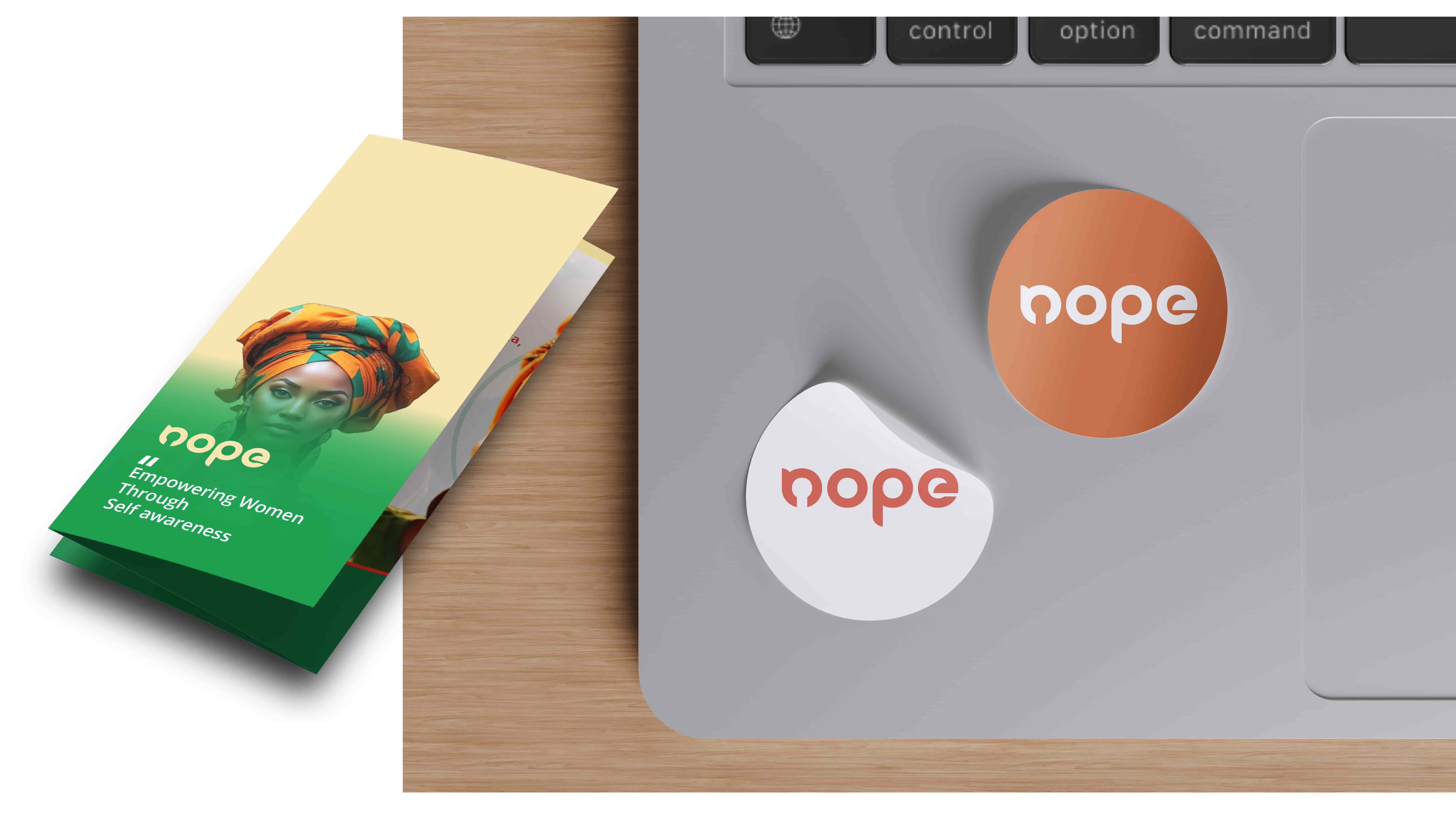
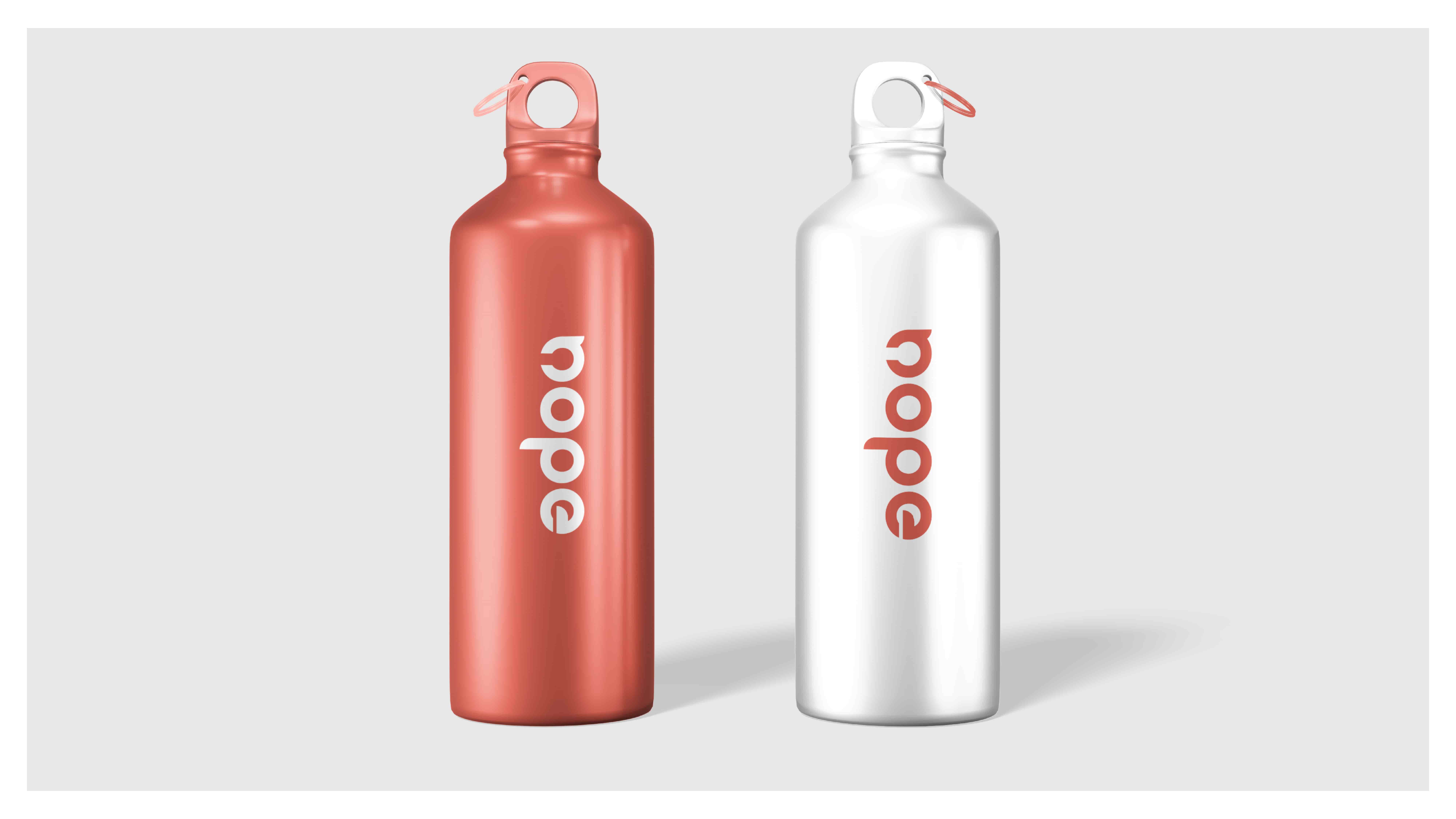
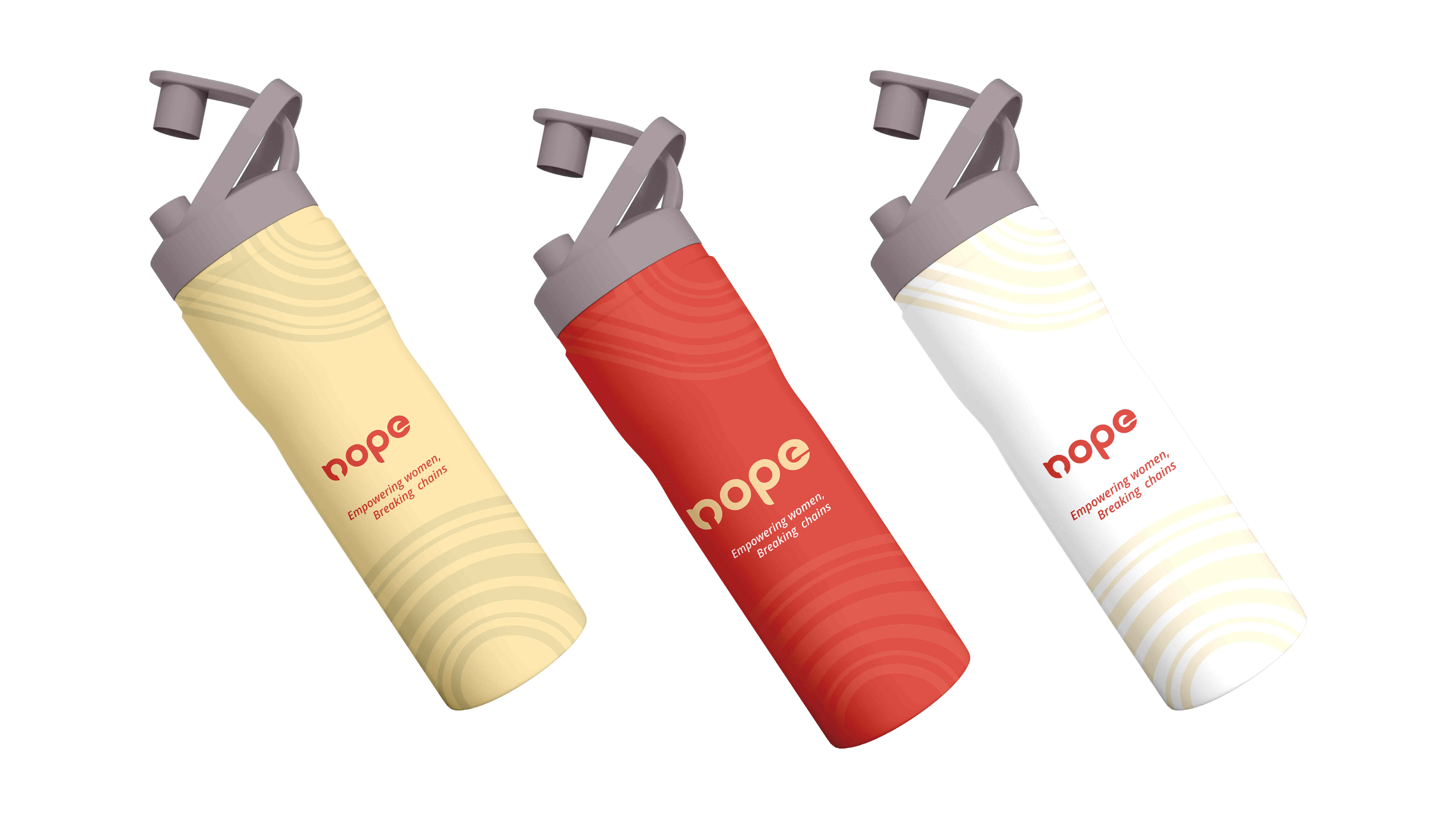
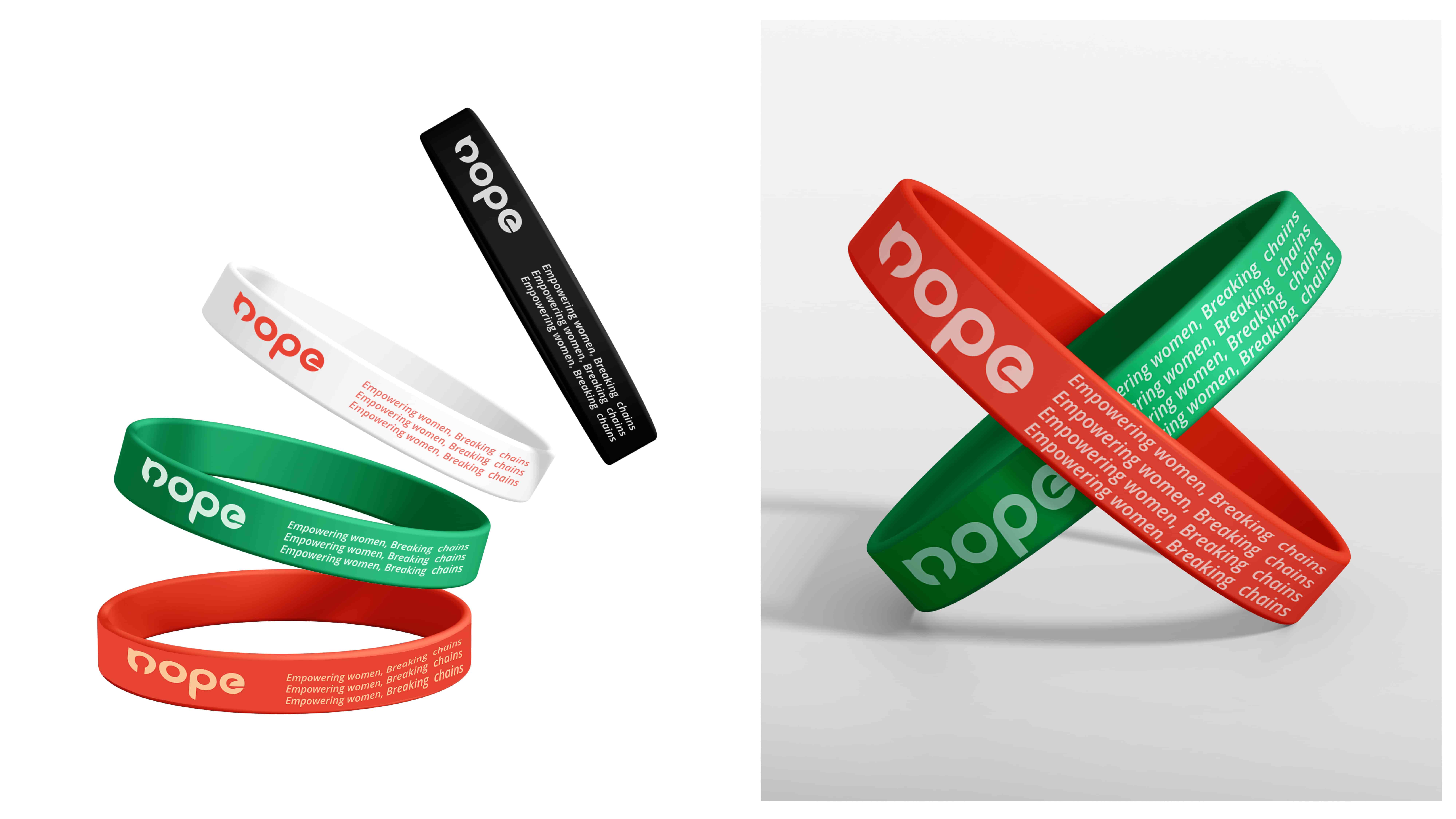
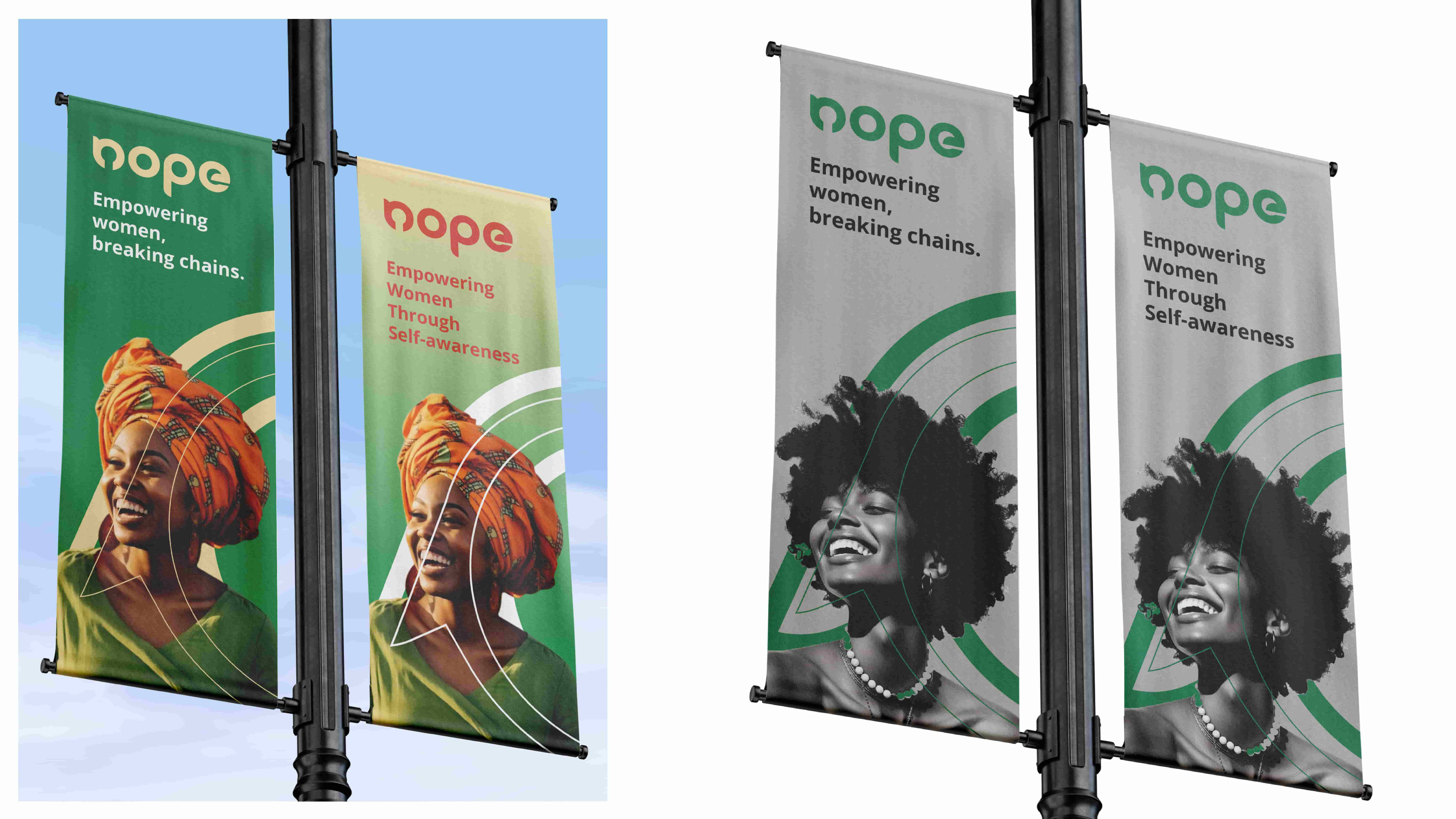
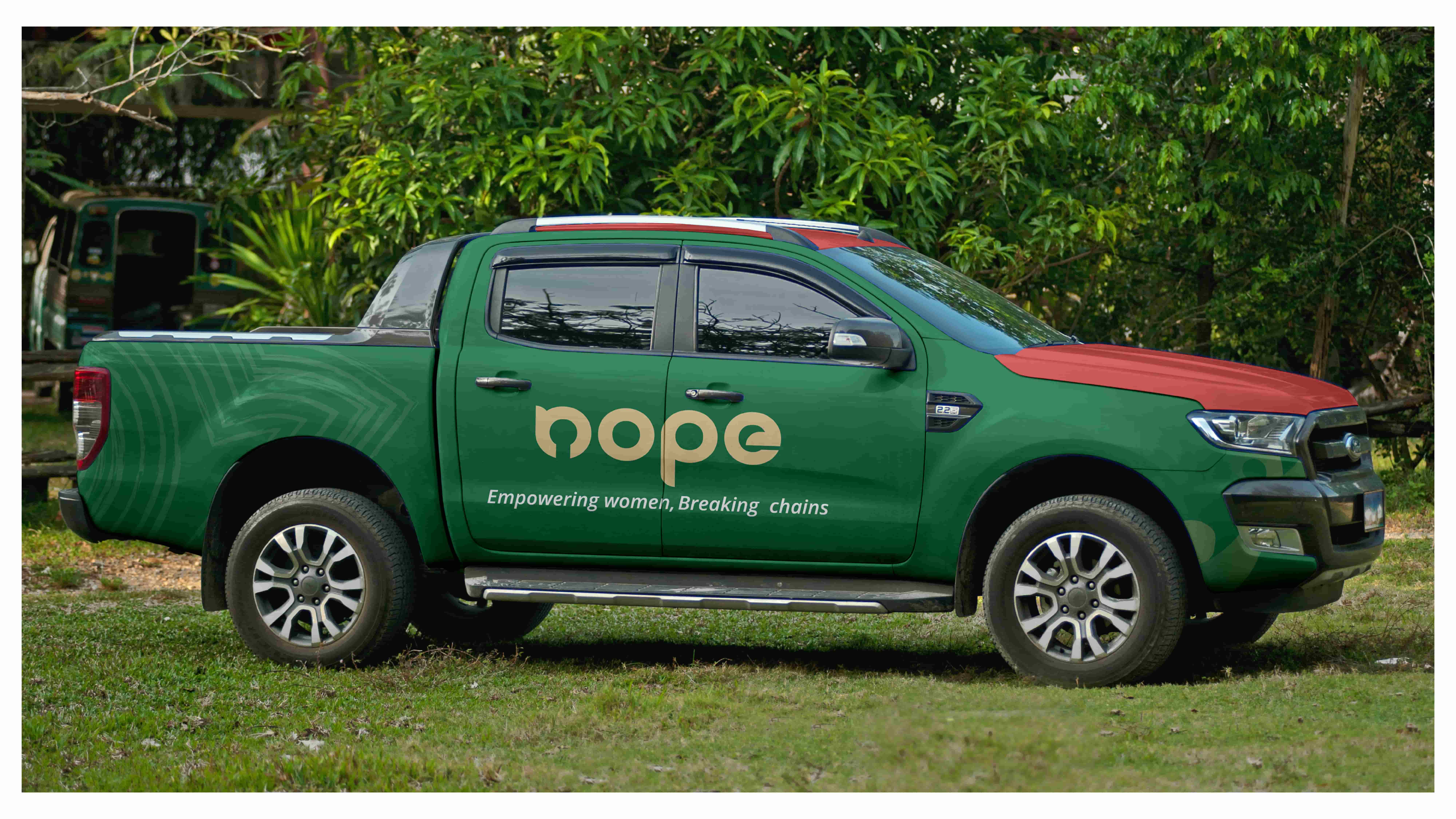
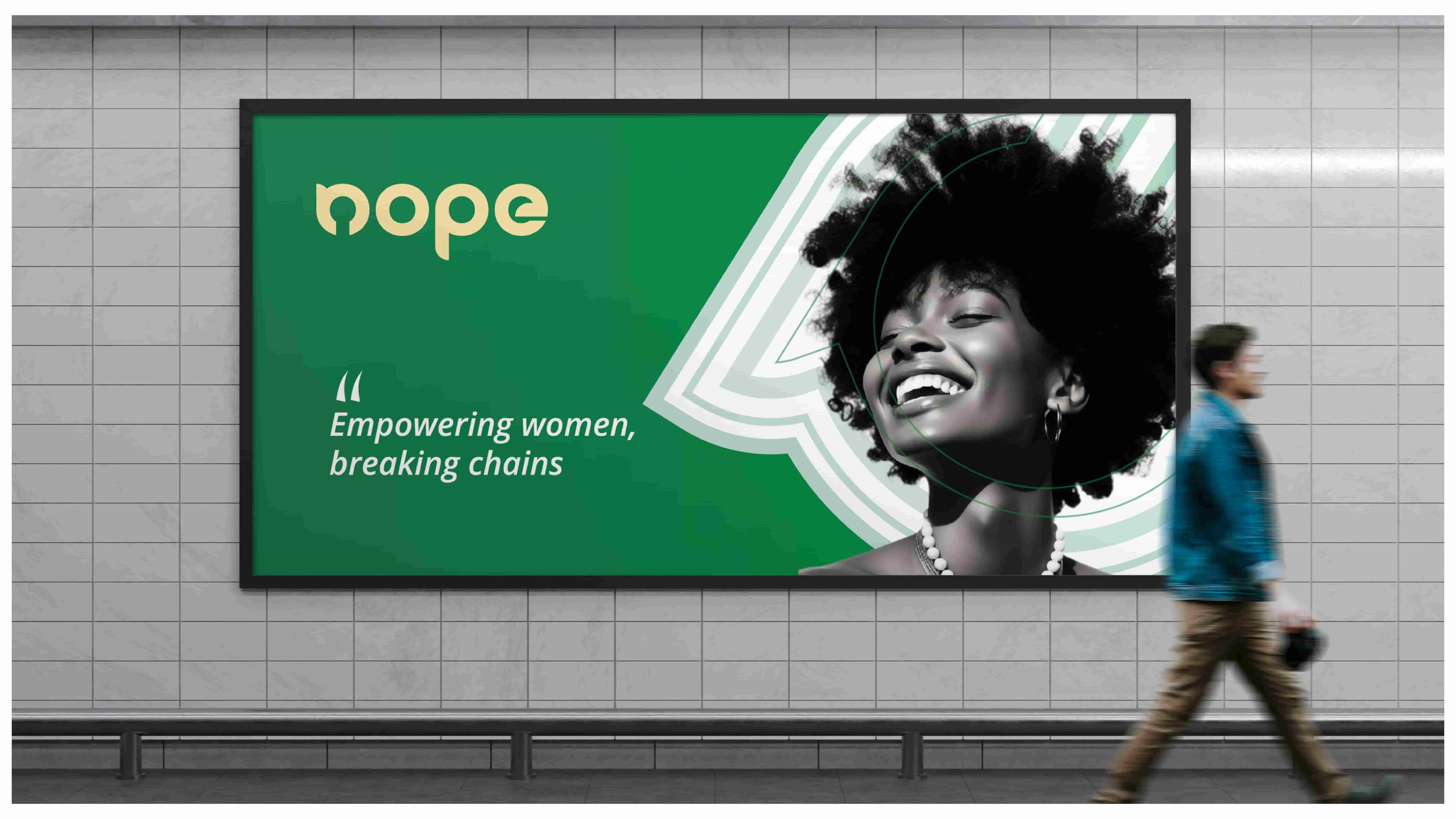
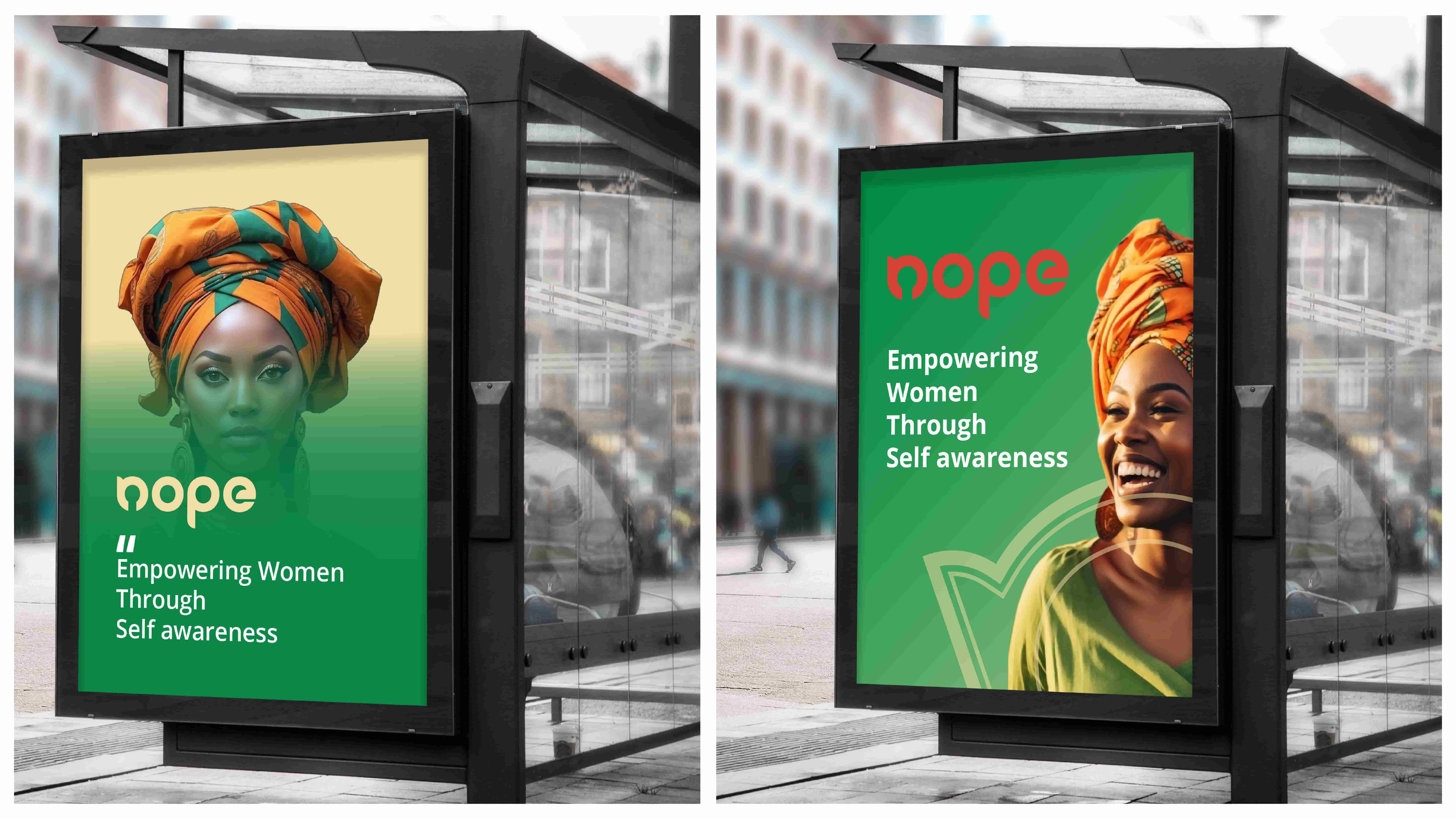
We built a "color-first" identity anchored by playful, chunky typography and a suite of custom illustrative marks. By utilizing a vibrant, highly saturated color palette, the brand naturally draws the eye without shouting.
The core of the system is its flexibility. We designed a set of modular packaging templates and social media grids that allow the NGO's internal team to rapidly deploy new campaign materials while maintaining a cohesive, recognizable look.